Wednesday, March 31, 2010

April Food Day 2010 is here!


Today is the 2nd annual April Food Day spearheaded by fellow bloggers Meg Fairfax Fielding of Pigtown*Design and Chris Cox of Easy and Elegant Life

While our heads are often in the clouds of gorgeous interiors and high end products, most of us really have our feet on the ground when it comes to those in need. With the economy, likely all of us have been experiencing some level of personal financial struggles, or know someone who has. If you've ever paused to decide between going grocery shopping or running the heat or putting gas in the car even once, then you know a little of what some people experience all the time. As tough as things are, if you're reading a computer screen and can even dream of beautiful interiors, then you, and I, are blessed and we need to "pay it forward".

April Food Day is our annual reminder to help out and asks that we all make a donation, no matter how small, to Feeding America. They are annually feeding 37 MILLION Americans, including 14 million children. This represents a 46% increase over 2006.  There is need, no question.

This year, in order to track the success of the April Food Day initiative, there is a special donation page that has been set up.


Thanks to Meg and Chris for making this great event happen. If you have any questions, you can email Meg here or Chris here.

Thank you.


 Subscribe to ::Surroundings::

Tuesday, March 30, 2010

Travel Tuesday: A tale of two hotels


Okay, so, I recently had a interesting hotel experience. A few weeks ago, I attended an event in Boston at a hip new hotel. Said hotel is part of a world wide chain of hip hotels. I was excited to go to the event and brought my camera, good blogger that I am. And I took one photo. This hotel was so poorly done, so depressing and cheap looking, yet so pretentious, I was actually angry when I left. Angry I'd spent even $10 plus parking to attend the event, angry because it's the kind of hotel people ooh and ahh over. It was awful.  An evening in this hotel can run between $300 and $400 per night.

Now, onto hotel #2. On my recent trip to the Architectural Digest Home Design Show, I drove from Boston to Stamford on Wednesday night and stayed in a modest hotel. The original plan was to stay in the Hilton, but by the time we tried to book the hotel, the cheap rates through Hotwire were no longer available. Okay, so I wanted to do the trip on the cheap, I admit it. So, my friend booked us into a 2-1/2 star hotel and I figured, for $80, we'd likely only be there a few hours anyway, so why not, as long as it's clean . And it's true, we checked in at midnight and checked out at 7AM. Well, I can't tell you how surprised I was at the quality of the room design. Admittedly, the exterior and lobby were still quite dated and a tad shabby, but this chain hotel has been remodeling their rooms and I have to say it, bravo! The bed was totally comfortable, the style was slightly modern, yet warm and inviting. The patters and materials were fun and up to date.

So, quiz time, the 4-star hotel is:

A)


B)


And bonus points if you can guess the hotels.


 Subscribe to ::Surroundings::

Blogger's Home Tour


 A big thank you to Emily Johnson of The Material Girls Blog for including me in her annual roundup of design blogger's homes - Unveiled! I'm honored to be included with: Patricia of Mrs. Blandings, Melissa, Cassandra, Leslie and Wendy of Chic Coles, Paloma of La Dolce Vita and Sarah and Alison of Matters of Style. Emily finishes up her tour next week with another great group of bloggers. So, bookmark it!


 Subscribe to ::Surroundings::

Sunday, March 28, 2010

Antiques are way better than dodgeball!


Each year, the boosters of my local high school's athletic department hold an antiques show in the high school gym as a fundraiser for those sporty type kids. Okay, I live in a small town and that does sound kind of hokey. But, the Duxbury Antiques show, now in its 29th year,  is truly anything but hokey. Fifty regional antiques dealers gathered and transformed that smelly old gym into a shoppers heaven. Yes, I also attended the same high school and I was most definitely not a participant in school sports, I was in the theater/music crowd.  So, with visions of dodgeball still dancing in my head all these years later, I headed over to the antiques show yesterday.  Here are a few of my favorite finds:


I first heard of Bliss Farm Antiques on Toma Haines' blog The Antiques Diva.  It was actually Toma's post that reminded me of the antiques show right in my own town.  Bliss Farm has a great visual aesthetic and deals in the super hot grain sacks and vintagy items that are so popular right now.


She had a sweet collection of lavender sachets. I'd love to see the fabric that this beauty came from!

Totally loving these French poodle knife rests.


The Scrapbook from Essex, MA showed a beautiful collection of vintage 1920's cosmetics ads by Fred Packer. How could one not have not wanted to run right out and buy what they were selling?


If I had room for it, I would have totally brought home this cute little painted table from Kathleen Fortuna Antiques of Scituate, MA.


Of course, Quimper pottery is always a winner. These from Camille Buda Antiques of Marshfield, MA.


This Shaker cheese basket had some damage, but it's so pretty isn't it? From Ciel Glynn Antiques of Cambridge, MA.


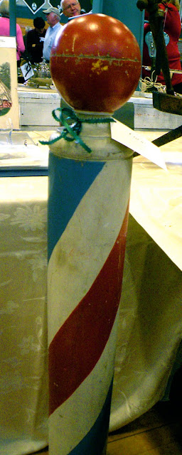
Ciel Glynn also had this adorable barber's pole. How cute would this be in a little boy's room?


Here's a very rustic New England style drop from secretary at William Nickerson Antiques of Orleans, MA.  This isn't an example of high quality cabinet making, but the price was very reasonable (I forget what it was).


All right, everyone, say aww...  The teddy bear is resting against an antique candle mold.


This Folk Art piece is the riser of a step - how cool is this? A big improvement over my Rubbermaid plastic step stool. A little harder to drag around, I suppose. From Robin Lloyd and Wayne Barron, Cambridge, MA.


And the top of the step. Way too pretty to step on!


One of my favorite finds of the day is Painted Pretty Furniture based in Abington, MA. They take vintage furniture and restore them with a new coat of paint and upholstery. Mostly the pieces were small and not fine antiques, but their eye for color is fresh and the prices quite reasonable.


If you enjoyed these pieces from the Duxbury Antiques show, check out Toma's blog The Antiques Diva later this week. I have a guest blog post of other great finds from the show.


 Subscribe to ::Surroundings::

Skirted Roundtable: Negativity in Design

This week on The Skirted Roundtable, we discuss negativity in the design and blog world and House Beautiful editor-in-chief Stephen Drucker's recent editorial on the subject. I wrote an editorial of sorts on this very subject in January, which you can read here if you care to.   And meanwhile, head on over to The Skirted Roundtable and have a listen and join in the conversation. It's quite lively.


 Subscribe to ::Surroundings::

Monday, March 22, 2010

Dining by Design New York 2010


I attended the Architectural Digest Home Design Show last Thursday and spent five glorious hours perusing the stands, exhibits and the always exception Dining By Design event, which was being held concurrently with the AD Show.

Dining By Design is the signature fundraising event for DIFFA (Design Industries For Fighting Aids), a national event that takes place all over the country. It's not a touring event, each host city mounts its own show with local designers and a local AIDS care related sponsoring organization. A very dear friend of mine died 20 years ago next month of AIDS before there were many of these types of organizations or the public acceptance of those with HIV/AIDS, so it's a cause near and dear to my heart.

The New York show was amazing, let me just say. My pal Rob came with me and he wasn't overly excited at the prospect of a bunch of dining table settings, but his mind was certainly changed here!

I hope you enjoy my photo tour. I recommend clicking the images for larger, more detailed, views.

This red table was very hard to photograph - but truly dramatic!

The New York Times.  Ann Marie Desalvo designs.


The mix of chairs and upholstered walls were the standouts here.
Architectural Digest. Design by Moore & Giles.


We thought all the ribbons, including the Blue Ribbon on the table was a cute touch.
Ralph Lauren Home

I loved this Kravet space with all the fabrics and colors. All the chairs could be slid completely under the table.
Kravet, Inc.

This table had great ambiance and I loved the table top detail (2nd pic)
Bradley Stephens

Bradley Stephens

Goil Amornvivat of Top Design Season 1 did this "telephone" table. Cute! Goil sent me this pic - mine was no where near as good!

Goil Amornvivat and Thomas Morbitzer for Tug Studios. Photo courtesy of Tug Studios.

I loved the small crystals hanging amidst the streamers. Some kind of lighted monofiliment mixed in would have been really cool.
Eric Warner for Aesthete. Ltd.

This Disney table had a lot of cute Disney charachter references, but none managed to show up in the photo.
Cappellini and Walt Disney Signature


Jesgordon/Properfun

There was a whole section of New York design student tables, which were fabulous and I loved that they were part of the show.
Students of Pratt Institute. Mentor: Marc Blackwell

This was one of my favorite tables, for the execution of the wall treatment. The visual detailing was amazing.
Students of New York School of Interior Design. Mentor: Michael Tavano


Students of School of Visual Arts. Mentor: Miles Redd


Students of NYU: Tisch School of the Arts Drama Dept. Mentor: David Rockwell

And here was another amazing wall and ceiling treatment. Kind of reminded me of a Robert Sabuda pop-up book.
Students of Fashion Institute of Technology. Mentor: David Stark

The Poggenpohl table was much more beautiful in person.
MMPI designed by Poggenpohl with Harry J. Danielle

I loved the table top, but didn't like that the benches (not shown) said "Artistic Tile" on each one. Seemed a little advertising overkill.
Artistic Tile by Vicente Wolf, VW Home

Fab.

Marc Blackwell New York

I don't remember taking this photo, but I love it!
Carini Lang. Design by Joseph Carini

This design didn't really read well in person or in the photo.  I think the table was too bright for the dimly lit space and the contrast too great.
Razortoothdesign

Loved the the New York Design Center had a bloggers table. So much fun and met Laura Newman of the Publicity Wit, who had interviewed me a couple of months ago.

 
New York Design Center

This was one of my favorites for it's fantasy appeal.
Continental Airlines. Design by David Beahm Design


I also like this techno table by Benjamin Moore. While very commercial, it was still witty and well done.
Benjamin Moore. Design by David Stark

And loved the "iPod" candelabra!


All photos by Linda Merrill except where noted.


 Subscribe to ::Surroundings::

LinkWithin

Related Posts Plugin for WordPress, Blogger...
Get Paid To Promote, Get Paid To Popup, Get Paid Display Banner