Friday, August 21, 2009

Vacation Home Virtual Decorating Project Update


I wrote about this virtual decorating project several weeks ago and wanted to give an update. This is a living room/dining area for a vacation condo. I've never met the client in person nor have I seen the home. I've seen photos and the client and I have been emailing madly since the project began.

The image above was my initial inspiration concept, just to get the ball rolling. The style we're trying to achieve is modern but comfortable. They need lots of seating for family gatherings and although the space isn't huge, it's very doable.

The image below is the floor plan that we've pretty much settled upon. As you will see, in the living room area, we have a sofa flanked by two side chairs and a chaise. The television set is in the upper right corner of the plan, so the seating has to be arranged with comfortable viewing of the television and the wooded backyard. The original plan for a sectional hasn't worked out because it's ultimately too static for the space and doesn't allow for alternate groupings of the furniture. As you will see, this plan below is #6. I did nine different floor plans in all, with tweaks to each depending on the individual furniture pieces we were looking at.


The clients found a 100" sofa (see below) which they loved after the original sectional idea was abandoned. I came up with the idea of using a stand alone chaise in lieu of a pair of chairs (closer to tv on plan) because it offered seating for two if there was a group all talking together, or lounging for one person who could also watch the television set, and it didn't obstruct anyone's views of the television set if it were empty. I also like the idea that they could pull it over to the empty wall between tv and kitchen for a separate seating area. Don't you just love multi-functional pieces???

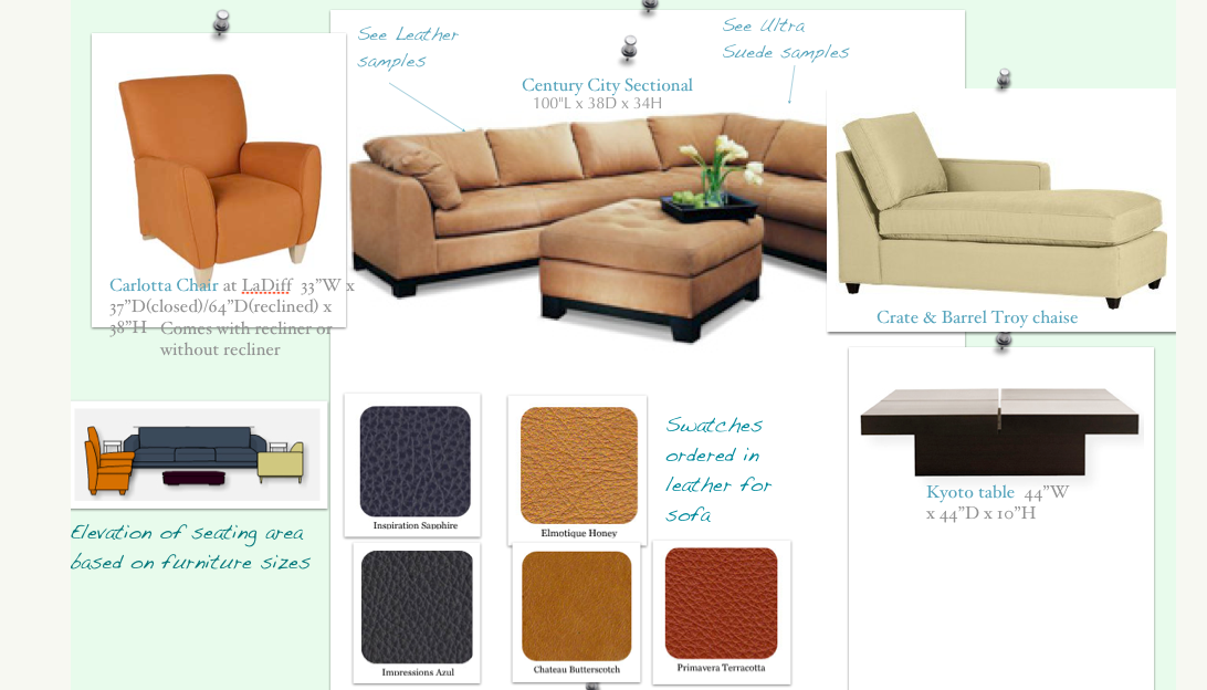
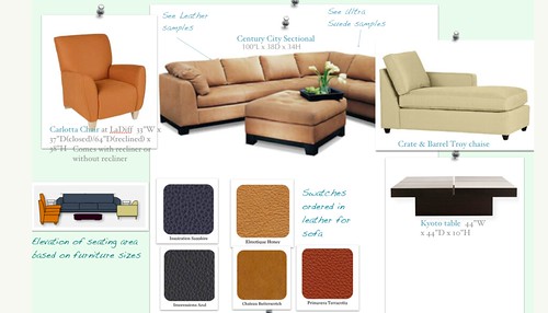
Between my client and I, we've narrowed a lot of choices down to the design board below. As you can see, the color palette is still leaning towards the original buff/orange/blue. We have not selected the leather for the sofa yet, which will really dictate the final choices on the rest of the pieces. We're still on the hunt for a coffee table. It's very difficult to find something that is modern and unique looking while still being affordable. The coffee table below is fabulous, but it is ultimately way too small for the all the furniture that will be around it. At 44" sq. but only 10" high, it would look downright Lillipution. Note the little elevation drawing in the left corner. It's to scale. That table is wee. So, the hunt for something bigger continues. We may have found something that the client is going to take a look at shortly.

Another aspect of the project are the window treatments. Take a look at the photo below of the client's back wall. Notice anything funny? And by funny, I don't mean ha ha. The transom over the slider isn't on the same plain as the one over the windows... One wonders how this could have have happened. But, the clients were at a distance from the developer and the deed was done by the time they noticed. There were other more pressing issues that needed fixing, so they wisely picked their battles. However, they are left with this off-kilter back wall. Since re-construction is out of the question, we will have to camoflauge as best as possible.

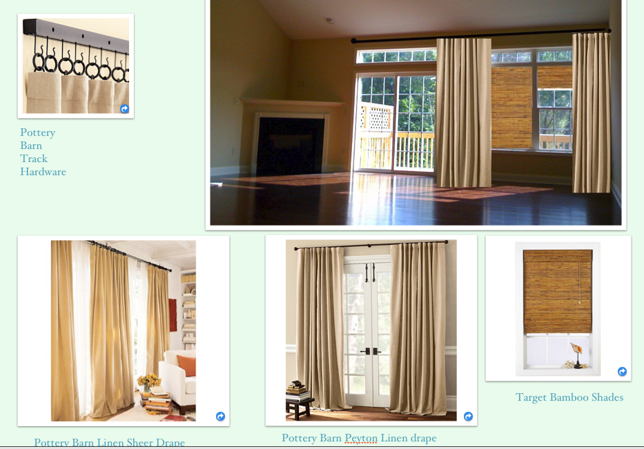
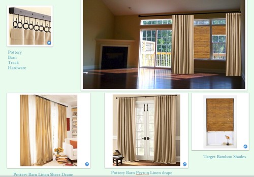
I am suggesting to the client that they hang simple linen drapes across the entire back wall off of a long curtain rod that is mounted near the ceiling. The idea is that the drapes to the right of the sliding door will stack right when open and close to the left. There is no room for stacked drapes to the left of the slider. The drapes covering the windows will pull towards the center of the window, as one would normally do. I am suggesting that they mount bamboo shades on the windows for a little interest and privacy. I also feel like it helps draw the eye away from the different transom heights. The image below is my mock up of how this would look in the real space. The drapes may either be sheer linen or lined linen, a decision on that is to come.

The images above are from the website page I have set up for my client. All my clients - virtual and in person - receive a page where we keep track of ideas and decisions, floor plans, etc. All of the product images shown actually link to the website of the store or showroom where the item can be purchased. This gives the client a chance to get more information - or even go ahead and place an order - without having to do any searching themselves. The floor plan near the top of the page also provides links to the furniture that is shown on the plan. The sizes are all to scale and when the client clicks on the furniture icon a small window pops up showing the actual product with a link to the store or showroom.

If you'd like to see this process and how it works, click here to view my sample design pages.

So, the client project continues, but is hopefully nearing the final decisions stage. I know they are anxious to have use of their vacation home!!


Subscribe to ::Surroundings::

Wednesday, August 19, 2009

The Skirted Roundtable - All about the bedroom


We're all about the bedroom this week over at The Skirted Roundtable. Come and join us!


Subscribe to ::Surroundings::

Monday, August 17, 2009

Travel Tuesday: A daytrip to Maine and the York Decorator Showhouse


(view out back of the showhouse property)

Last Friday a decorator friend and I drove up to York, Maine to visit the York Decorator Showhouse, which was closing the next day. Well, the trip, company and the beauty of Maine were all winners. Unfortunately, the showhouse was just a bit disappointing. First off, they wouldn't allow photography. Huh? I just don't understand how a showhouse can justify the restriction of photography. Regular folks want to take pics of things they want to remember for inspiration in their own homes and bloggers like moi want to show the work of the hardworking decorators to the world and offer a little promotion for the charity the showhouse is supporting. Secondly, the showhouse itself wasn't spectacular. Most of the rooms were mediocre at best - common and nothing special. There were some highlights, however. I am going to contact a couple of the decorators to see if they have photos they can share. Meanwhile, here are some shots of the beautiful Maine coastline.


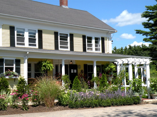
The McIntire Farm - York, Maine. Location of the York decorator showhouse took place in this 1920's farmhouse.

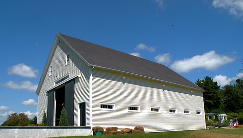
The McIntire Homestead dates to 1707 and according to one of the tour guides, the house below, which is next to the Farmhouse, is the oldest house in Maine.
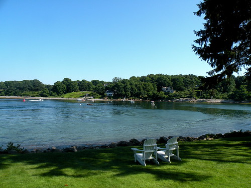
After the house tour, we had a lovely lunch overlooking this beautiful view of an inlet on York Harbor. There's just something about Maine!

Mainiacs swimming in frigid waters. It's not unusual for the water to still be in the low 60's in August.

The picturesque Nubble Lighthouse.

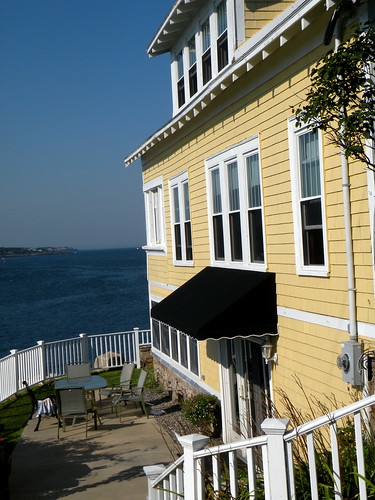
And a couple of homes overlooking the ocean. The yellow house is an adorable rental and the bottom photo is of a private home. Not a bad life!


Well, hello Atlantic Ocean!!

I hope you enjoyed this little photo tour of lovely York, Maine. And stay tuned as I hope to have some photos of the interior of the showhouse soon!

All photos by Linda Merrill.


Subscribe to ::Surroundings::

Saturday, August 15, 2009

Friends, birthdays and the art of listening

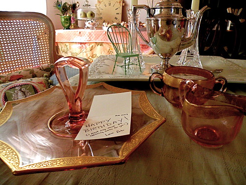
Several years ago, I inherited this pink and gold Depression glass sugar bowl and creamer from a great Aunt. I've always loved it and take care not to wash so much that the pattern completely wears away.

A couple of months ago, my Mom and I were perusing a local antiques shop and I came across an octagonal cake plate with handle that was a near perfect match for my set. What a cute way to serve coffee and dessert! My mother, being a depression baby herself, and knowing that business is slow for me right now, looked a little skeptical at me as I cooed over the pretty pink and gold plate. There may have been some comment made about paying the mortgage. (rasa frasa grumble grumble...) So, I left it where it was. Because, no matter how old (ahem) we get, our mothers still have power over us.

But I was sad and knew had she not been there, I would have justified the expenditure and bought it. I mentioned it to a couple of friends (it was still on my mind, you see), both of whom felt I should have bought it anyway. What would we do without our friends! It wasn't terribly expensive, afterall. But, it wasn't a necessity either.

Anyway, a few days ago, a mysterious package arrived on my door step. Guess what is was?

I could have cried. My dear friend Rob, whom I'd been whining to about the pretty cake stand, did some detective work, called my Mom (who frankly didn't even remember what it looked like!!), secretly scoped out my creamer and sugar set while at my house and then wandered around the antiques shop until he found what he believed was the right thing. He doesn't know what Depression glass is and had no way to actually describe it. But he found it. For me. Because he knew it was a pretty little something that would make me very happy.

So sweet.

It's not about the cake stand after all.


Subscribe to ::Surroundings::

Thursday, August 13, 2009

The "Tiffany Pillow" Bedroom update


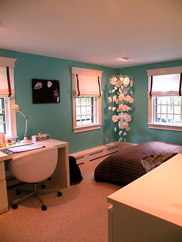
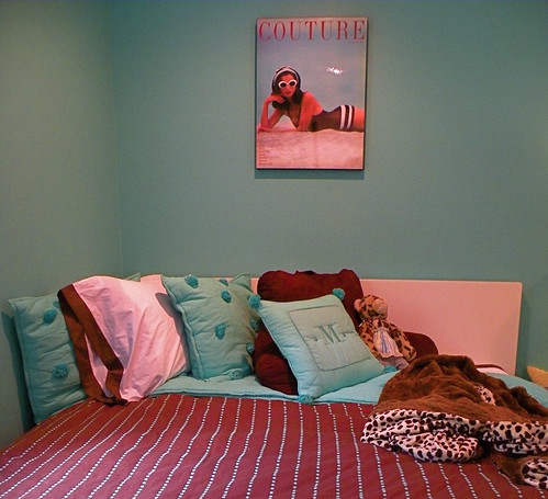
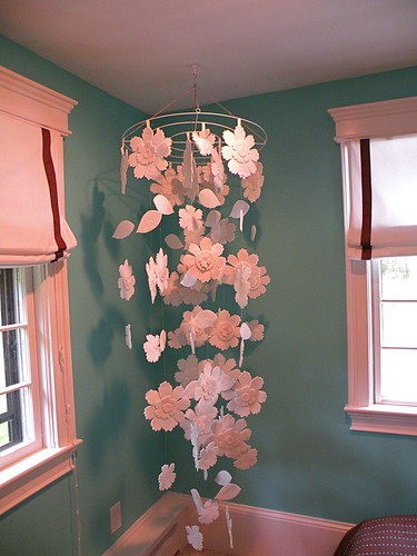
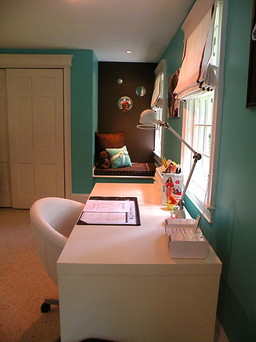
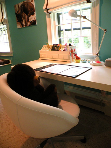
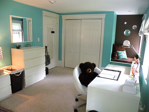
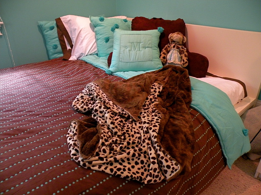
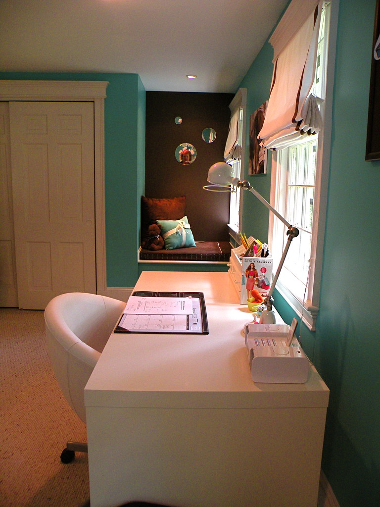
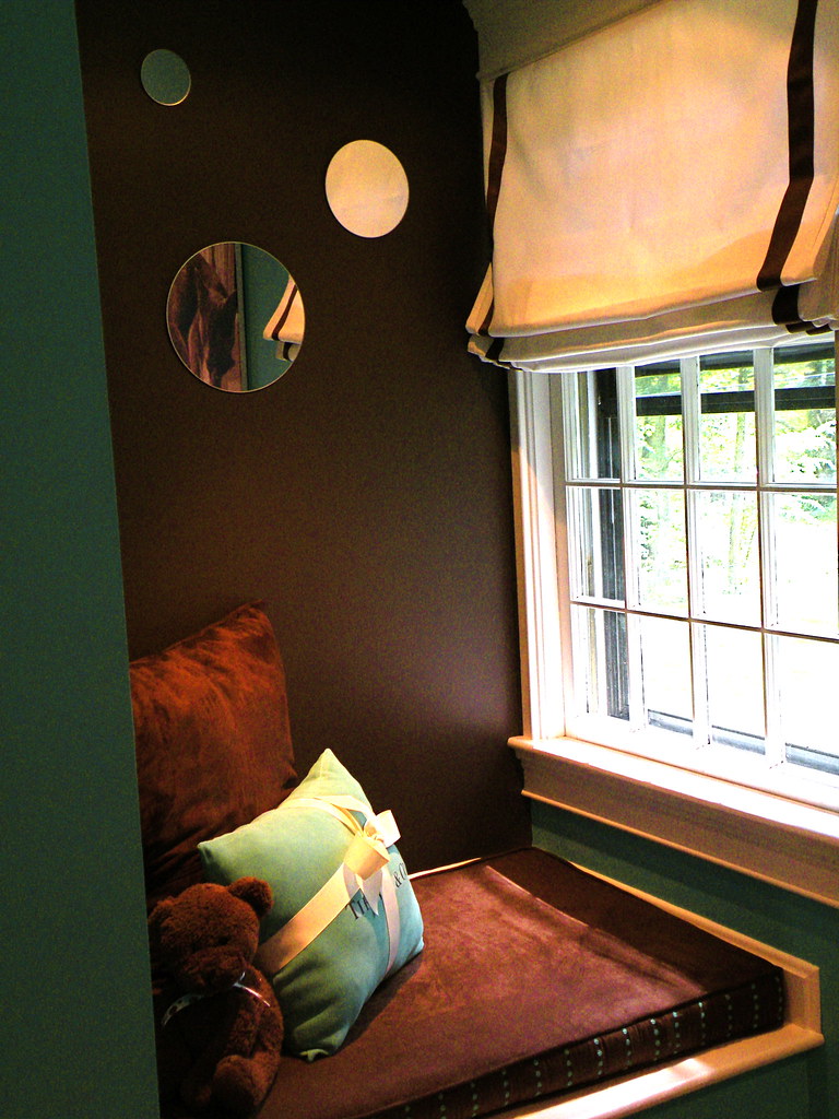
I blogged last week about this "Tiffany Pillow" and window seat cushion that I made for my Goddaughter Maddy. She's enterting high school and she and her parents went to town on her bedroom. They all did a great job and I wanted to share the final project with you. The room has gone through several changes and was most recently a mid-toned blue. Her dad added all the new moldings above the windows and doors, plus made custom wood baseboard heater covers. The furniture is from Ikea, the bedding is mainly PB Teen, with some Target and Homegoods thrown in.

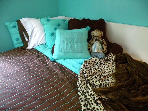
How fun and hip is this bed with the chic "fur" throw. The stuffed tiger (I think) has been a long time friend of M.

You can see my pillow and cushion in the window seat - and me in the mirror!


My friends did a great job with this project. It's youthful and exuberant, yet hip and trendy as well. The wall color is bright - but not enough to make you squint - and all the white accents just pop!


Subscribe to ::Surroundings::

Wednesday, August 12, 2009

A gorgeous Cape Cod vacation home


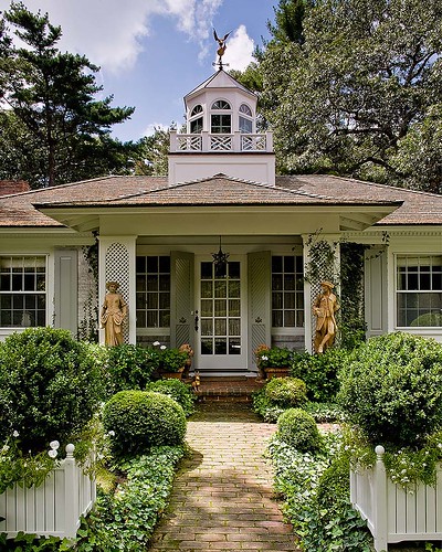
Ever since this spread of designer Richard FitzGerald's Cape Cod home appeared in Design New England Magazine, I've been dying to share the images! As I know and have blogged about the photographer, Michael J. Lee, I asked him right away for permission to share his gorgeous photos of this beautiful home. And now I can finally post them!

Mr. FitzGerald is an old school interior designer. Based between Massachusetts and Florida, he's had the kind of career that doesn't require lots of marketing and promotions. He was inducted into the first class of the New England Design Hall of Fame in 2007. His work has appeared in House & Garden, House Beautiful, The Boston Globe and Cape Cod Life, among other publications. FitzGerald also spent a number of years as the decorating editor at House Beautiful and the east coast/European editor for Architectural Digest. But, for all this, when I posted about the Hall of Fame, I was unable to find any photos of his work online!! So, I was thrilled to finally see inside his personal space - his Cape Cod vacation home. Mr. FitzGerald is an avid collector and gardener and his house and gardens reflect his love of both.

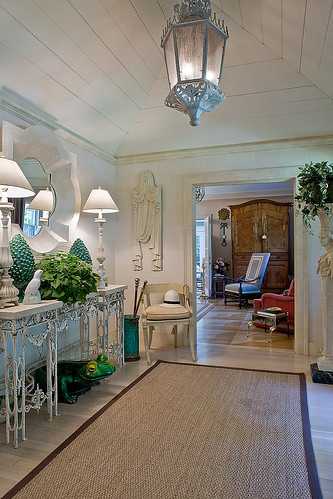
This entry way of the house reminds me very much of Edith Wharton's entry way at The Mount. It has a decided indoor/outdoor feel which smooths the transition from outdoors to in. The lantern hung from a vaulted, barnboard ceiling feels very porchlike. The iron and stoneware, garden frog and plants enhance this feeling.

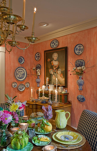
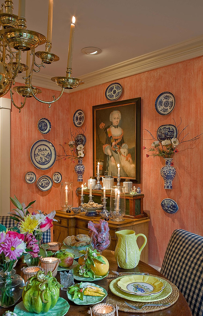
How gorgeous is this combination of peach wall with the blue and white! The walls took their cue from the "ancestor" portrait and the blue and white is carried through the pottery and check on the chairs.


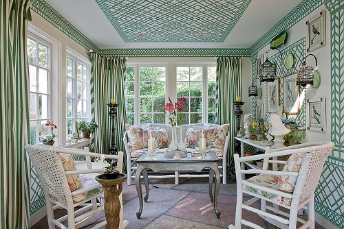
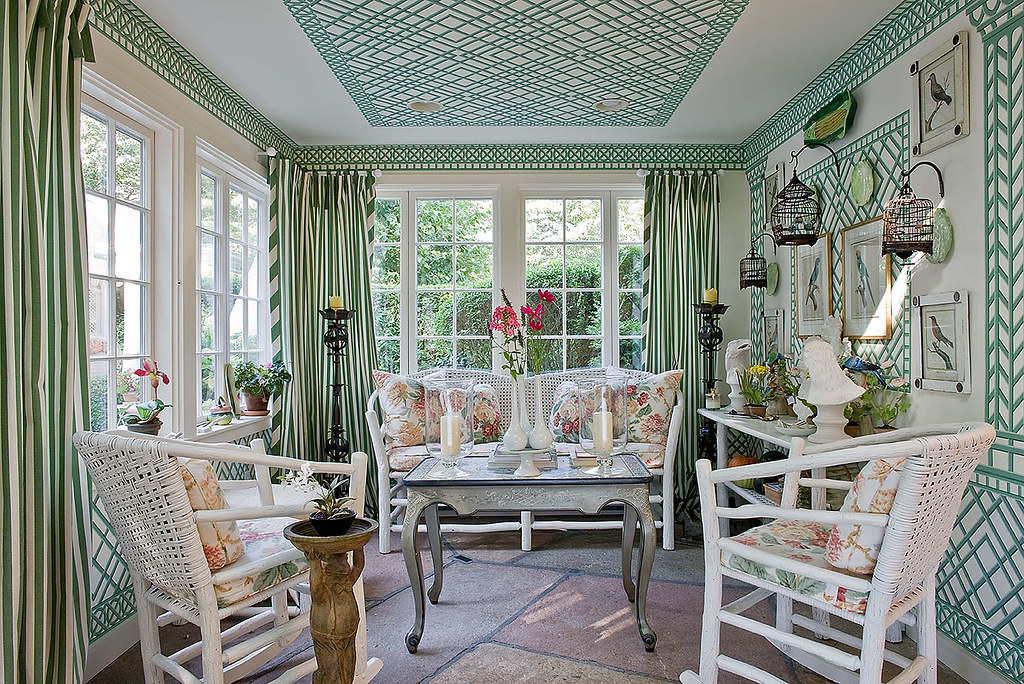
How adorable is this little sun room? One thing I find interesting is that the drapes are stationary - they can't be pulled across the windows. As an aside, this is a great cost saver where an oppulent look is desired, but when privacy isn't an issue .

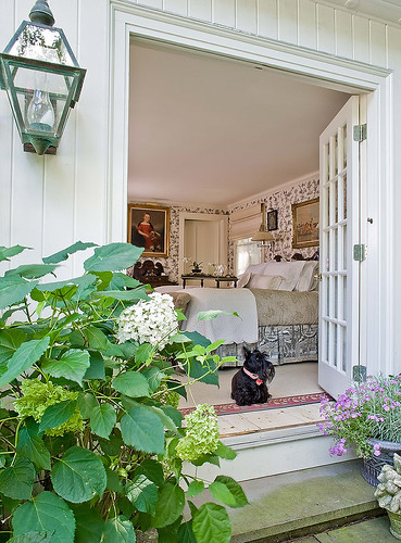
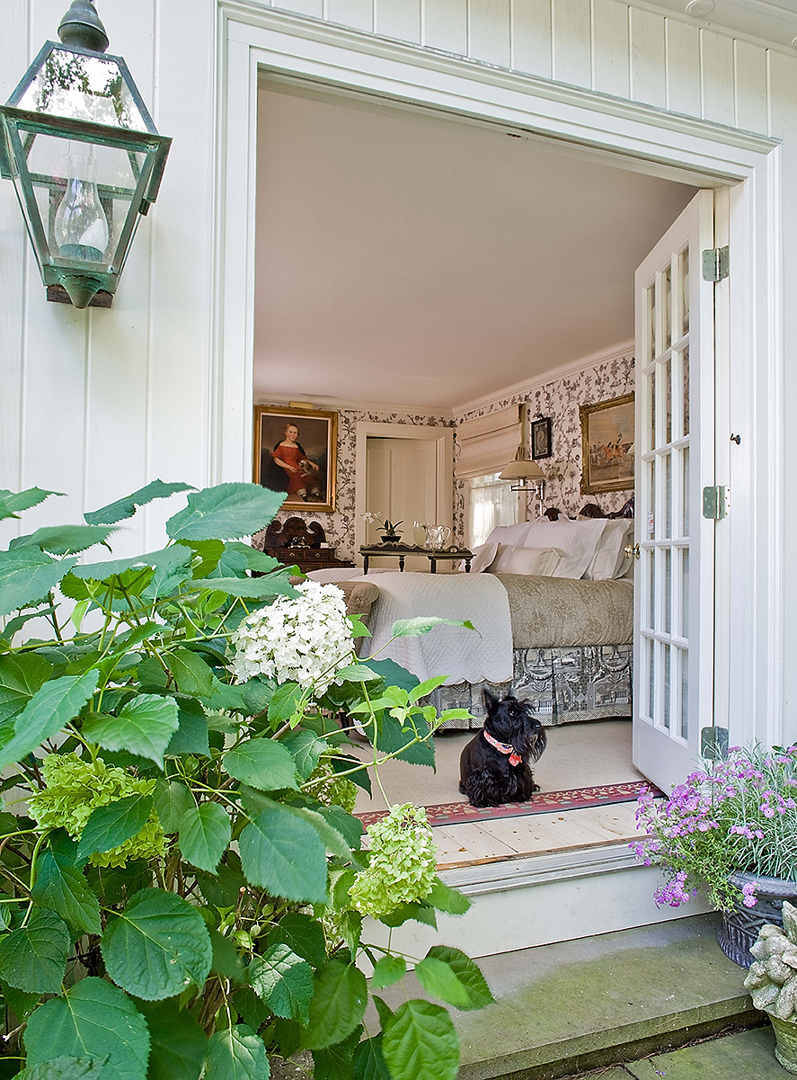
The master bedroom opens up to the garden. The master's master surveys his domain.


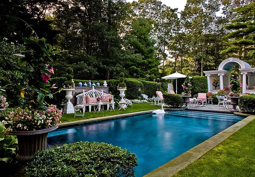
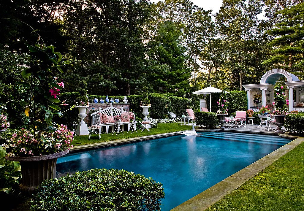
And the jewel like pool and gardens.


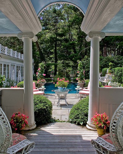
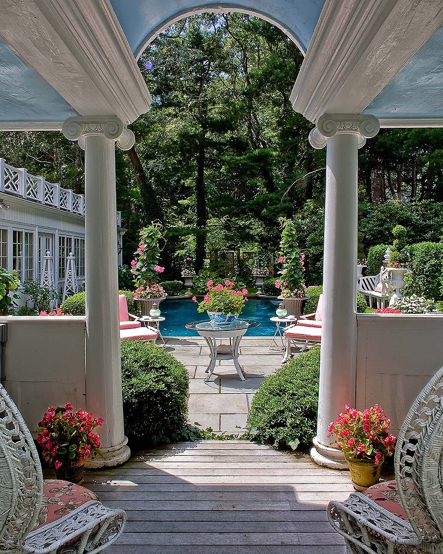
Mr. FitzGerald refers to himself as a "Jeffersonian" which is apparent in the classic proportions of the pool house. The glossy white with blue coved ceiling is stunning, isn't it? And I love the pops of pink on the upholstery and plants. Easy and breezy.
Click here to view larger image

Cape Cod vacation anyone??

Well, a big thanks to Michael J. Lee for sharing his beautiful photos with us. You can view his website and portfolio here.


Subscribe to ::Surroundings::

LinkWithin

Related Posts Plugin for WordPress, Blogger...
Get Paid To Promote, Get Paid To Popup, Get Paid Display Banner