Friday, January 8, 2010

A tale of two houses

I've done a lot of posts on the beautiful old homes that make my town of Duxbury, Massachusetts so special. Founded in 1636, the town has architectural style coming out the wazoo. (look it up, it's a word).


I wanted to share two properties that are currently on the market that are completely different than most of anything else in town. Interestingly, they are next door neighbors located at the end of a very normal looking side street dotted with small and very average (cute, but average) homes. Not every home in town is historic or large, despite what I've shown!  You'd never know there was not one but two mansions at the end of the road, I can promise you!
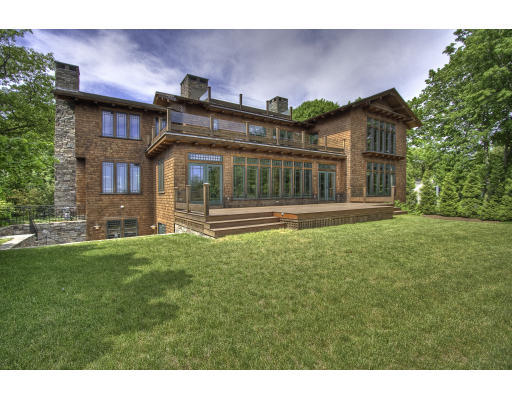

The first home, at 32 Morton's Hole Way, is described as a California Arts & Crafts style home with strong Japanese influences and was built after 2003. I've been by this home several times on my way to house #2 (more on that later) and have found it to be an intriguing property that I'm happy to finally see more of. I love the exteriors of Arts & Crafts home, but funny, not so much the interiors. I think it's just that they are so relentlessly "of a style" and unless that style truly speaks to one's soul, I would think it would get monotonous. I would liken it to jazz - you either love it and "get it", or after a while it's just a lot of noise that's hard to interpret. Not sure if any of that makes sense.


So, let's take a tour. Photos courtesy of Redfin.com. This house is on the market for $3,750,000. And for this town, the location with water views and quality of the home itself, the price feels like a steel and is truly priced based on the current economy.  Three years ago, there were comparative shacks for that price. Okay, I exaggerate. A little.
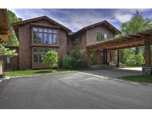


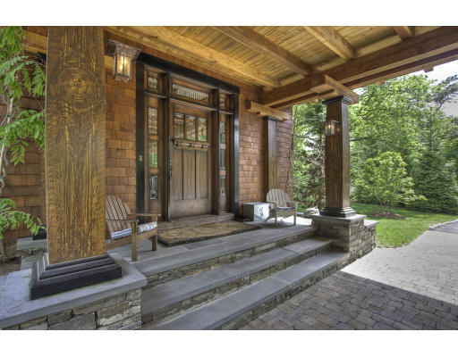
This entrance is just too beautiful, don't you think?


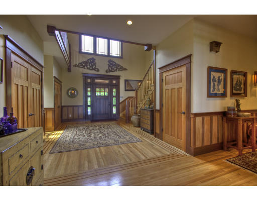
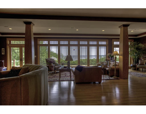
A room with a view. The columns are like those at the Porte-Cochere.  The shape is pretty magnificent, isn't it?  


The bedroom seems oddly empty, but it could be the camera angle. 
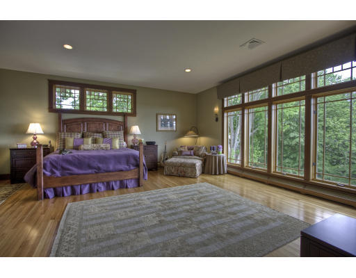
 
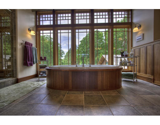
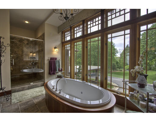
The master bath is spectacular - but you would you want to take a bath in a picture window overlooking the driveway?  It's hard to imagine that the sight lines aren't actually obscured so that this room is indeed more private, but from the photo... 
 
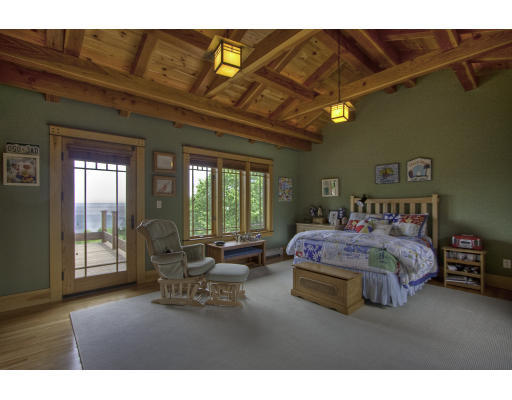
The beamed ceiling... yum. 
 
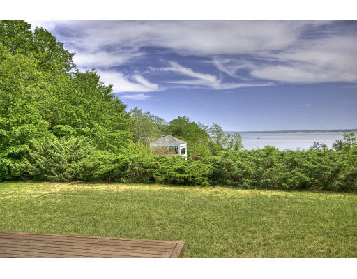
The backyard overlooking Kingston Bay.
 
 
Here is an extensive video tour of the house as well. The agent is Michael Gill and there is a website with photos and more information here.


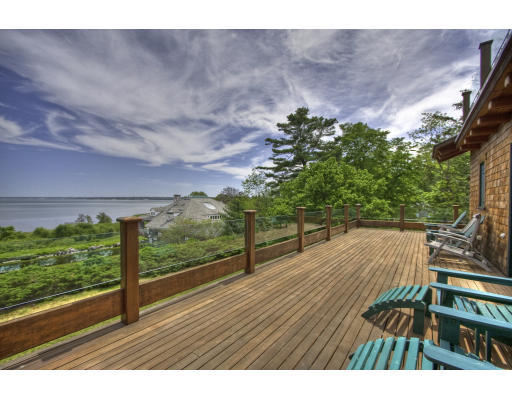
Looking out from the back deck of house #1 towards Kingston Bay, you will see that it looks over another property, which is the second stop on our tour.


The neighboring property is located at 34 Mayflower Lane.  The house was built in 1995 and was designed by a California architect and is in a style I would describe as California Shingle style.  This house has been on the market nearly four years and is a victim of the recession. It's currently on the market for $5,999,000, which is significantly lower than the original asking price.  I was brought in to stage the home by the original real estate agent. While it was beautifully decorated, it had some organization issues and an empty room or two that needed to be dealt with.


This is a very large home, but only has four bedrooms, as it was custom-built by the sellers who had a young family. The house has an unobstructed view of the waterfront, which accounts in part to its higher price tag than House #1.  I've never been a fan of the driveway side of the house (above), but this water side below is gorgeous. 
 

The house boasts an outdoor swimming pool with fully outfitted pool house (as well as indoor lap pool) and beautifully manicured lawns and gardens. House #1 overlooks the pool, pool house and garden.


An inside view - the front foyer is overlooked by a wrap around second story. The doorway underneath the stairs leads to the in-house lap pool and mini spa, as well as the home-theater. The glass door is the front door of the home.
 

Here is the view into the living room. The pendant light is large and spectacular. When I was first brought in, there was a large round Dakota Jackson table placed right underneath the pendant, blocking the view of the seating area and fire place. That table was the first thing to be moved.


One of my favorite spots in the house was this adorable little sun room, which is off the living room. 
 

Here is the fully outfitted home theater. I never particularly loved this room as it was too bright and almost garish as compared to the calm tones of the living room. But, that's just paint and new owners an easily rectify that!

The kitchen was a beautiful space that showed great restraint in decor and is a real cook's kitchen. This was actually a remodel of the first kitchen that was put in.


The breakfast room. I so covet that lantern. You can see the pool outside the glass doors.
 

This is the family room area off the kitchen. I suggested the large photo canvas over the fireplace in order to remind potential buyers of the proximity to water, as this room has little water view. It also related to the yellow ceilings. You can see into the dining room to the right of the photo.

One of the reasons I was brought in was to deal with the very empty dining room. This room had the best view of the bay yet due to circumstances, the room sat empty - not a big selling feature.  You can see the living room down the long hall at the right hand of the photo.
 
 Here is my staging of the living room. It now sits empty again (apparently, by the newer real estate shots). 

The owner was not interested in purchasing new dining room furniture just to stage the home and at the time, there were no rentals available that fit the style and quality, not to mention size, of the home. So, instead, I suggested a "music salon" concept with grand piano in one corner (large and in charge!) along with a smaller, more intimate dining area by the fire place.  I made use of the Dakota Jackson table that had originally been taking up space in the living room here. The red leather chairs were purchased from Design Within Reach and the oriental carpet was purchased to complement the yellow walls, blue water view and red chairs. These colors are softer versions of other rooms in the home.


Dining Room staged by Linda Merrill

Here is the "salon" that is off the front foyer and sits between the dining room and living room.  This was the most traditionally styled room in the home.


Upstairs is the library that was tucked away for private reading.


The home office. 
 

The Master bedroom. Given the size and scope of the home, the Master was actually quite small. It was nice, intimate. The bed is placed in front of an etched glass wall that lead to the dressing rooms and master bath. The bedroom also had a private deck over looking the bay.

The master bathroom. These photos do not do it justice. 


There are no photos, but there are three more bedrooms and two more full baths.

My favorite part of this property was the antique guest house. I don't know why the realtor's never show the interiors of this house - it is completely adorable! It has a full scale kitchen with cream colored cabinetry and granite counters, 3 bedrooms and a living room. I'd have moved in here in a heart beat and let my guests have run of the big house.


This property is currently represented by William Raveis and you can see the full listing here. 

So, the question is, assuming money is no object:


Which house would you buy?

House #1 - California Arts and Crafts

House #2 - California Shingle Style


pollcode.com free polls


 Subscribe to ::Surroundings::

Thursday, January 7, 2010

Thanks Houzz!


 Subscribe to ::Surroundings::

Wednesday, January 6, 2010

Stuff I wish my designer told me…


Contributed by Lori Dolnick

Have you ever had that realization moment… that head slap moment when your design project is completed and you wish you-knew-then-what-you-know-now? Being part of the design world, I have that moment all the time. Every time I go to a trade show, showroom event or client new product brief, I see or hear some tidbit that makes me want to rip out my walls and start over again. I named this story, “stuff I wish my designer told me,” because designers do have a universe of knowledge inside their heads, but they don’t always remember to share. And they can’t be clairvoyant either – knowing you’ll want something that you don’t even know exists. Here’re five of my moments in hopes that we catch you before you can hit yourself in the head.

According to Top Knobs, a fine cabinet hardware company, what’s old is new again. Many of yesterday’s styles are today’s hottest. Their new bath hardware line offers six interchangeable back plates that change the look of a hook, tissue holder or other piece of hardware by sliding a uniquely styled plate beneath. The back plate lets you match not only the finish – but also the style of the hardware to your faucets and other fixtures. Makes me just want to take a screwdriver to my downstairs bathroom when I see that while I neatly matched the finishes of my hardware on my last DIY makeover – I neglected to match the architectural styles completely. (Another tidbit I just learned – look for knobs like Top Knobs with sealed finishes. A sealed finish won’t show wear from hand oils where a “living finish” will. Without a sealed finish, the knobs you use more often will wear faster than knobs you don’t.)


While my kitchen designer was truly amazing… she did recommend a stainless dishwasher to me. Ok – she’s young, she has no kids… did I say no kids? How many dented stainless dishwashers have you seen in your friend’s kitchens? Unfortunately many kitchen designers, unless they have children of their own, won’t see their once pristine dishwashers – now dented by toddlers who fling themselves at top speed into their shiny surfaces. Thank goodness manufacturers like Miele offer integrated models. I worked with my designer upfront to change the stainless to a cabinet wood door and I’m so glad I did. Dented wood offers character. Dented steel – not so much.


I love my stainless sink. The shape and the depth. (Depth is really important. Another tidbit - make sure your watering cans and big pots sit comfortably in your new sink so you can fill them without tipping them out.) But then BLANCO showed me their new SILGRANIT II line and SIGH… that head slap moment again. Here’s a stone composite you can’t scratch, stain or dent. Given my overall clumsiness and affinity for heavy iron skillets – this would have been nice to have known before the stainless sink was spec’d in. And I love that you can have a sink in a natural stone color. It’s warm and inviting.

Don’t settle for less than a flush transition from one room’s flooring to another. Don’t let the floor company lazily dump an ugly metal piece in between. Flush transitions are do-able and they take that “accident-waiting-to-happen” piece of metal or wood out of the picture completely. I think we had to do like three floors before we pushed to get this done right. We have an oak floor flush to our walnut without a rise or transition on three sides and it looks beautiful.

When we did our treated wood deck, I had no idea companies like Trex or Atlantis Outdoor Kitchens even existed. If only I knew then what I know now. Composite decking does have its issues, but the saving in having to treat and stain the wood deck every couple years would have been worth the added expense upfront. Not to mention the absence of splinters. I’m also intrigued by the advent of outdoor kitchens in recent years. And I may upgrade to a kitchen instead of a grill on my next go-around. Atlantis offers easy-to-clean Perma Panel doors that resist heat and cold and they would neatly offer storage and convenience for outdoor grilling. It’s a great look and function for frequent outdoor barbeques.
Contributed by Lori Dolnick.


Click here to read all of Lori's posts.


Tuesday, January 5, 2010

The Skirted Roundtable: Stephen Drucker speaks his mind!


Join Megan, Joni and I this week at the Skirted Roundtable as we sit down with Stephen Drucker, editor-in-chief of House Beautiful magazine. Our far reaching discussion spanned Stephen's career path, his belief that only the best should appear in the magazine and his views on finding good design wherever you go.

Please join us!


 Subscribe to ::Surroundings::

Sunday, January 3, 2010

Linda's Kitchen: Heading into the home stretch


 Well, I did have a crazy notion of getting the whole kitchen finished over the holidays. Didn't happen, but I'm close. My dear friend Rob spent New Year's eve and New Year's Day working with me to get the final big projects finished and we did just that, I'm very happy to report.

Here's a little reminder of where we started. Note the long wall entering the kitchen and the really odd looking pot rack tacked up on the wall. The pot rack was a homemade thing made from copper plumber's pipe, chain and S-hooks. It did the job, but it was not particularly attractive.


So, the job for this week was to put up new molding around the door opening and along the wall edges where the wall opens up into the kitchen, re-install the pot rack in a more pleasing manner and add a counter for additional surface space and concealed storage along this long wall.


Okay, so Day 1 was finished with the installation of the moldings and it was time to celebrate New Year's Eve with a late dinner of pork loin with a mustard glaze, blue cheese and red bliss mashed potatoes, broccoli (I only eat it raw, not a big fan of cooked veggies) and apple sauce.


Day 2 began with a homemade bacon and broccoli quiche (won't bore you with photos) and "final" decisions on how to build the new counter. This has been a very budget project and I had decided to use an old narrow door that I had in the back of my garage.  You can just make it out behind the white chair and striped beach chair below.


I'd spent the last several months debating what to do about the legs for the counter. While I do intend to put a skirt on it to conceal storage below, I did want decorative legs and was hoping to be able to do an exposed leg with the skirt running behind. However, budget is a concern and really beautiful wooden legs were not a possibility. I did have an old family table in the garage and thought we could use the legs, with something added to make them counter height. I also really liked the reuse, repurpose, recycle concept of this project.


Getting the pieces and parts altogether:


Okay, so this was an experiment. Using Liquid Nails, we glued 2x2x6" blocks to the tops of the table legs to make them 34.5" for the 36" height counter.  We tried nailing them as well, but that wasn't too successful.  Now, you have to give us props for this excellent use of my wine rack set on two chairs as "holders" for the legs so they could dry upright. Well, most of you are likely well ahead of me - this just was not going to work. The Liquid Nails did not seem like it would really provide enough hold and we finally accepted that this was not the way to go. So, back to Home Depot (trip #3 in less than 24 hours) for 2x2x34.5 cut wood. A little boring and plain, but cheaper than turned legs. And I can cover them up.


So, while I made my final trip of the day to Home Depot, Rob installed the pot rack, the right way. We still used the plumbers copper pipe (re-polished). Instead of bracing it against the wall, Rob hung it off of a ceiling stud. So, there is some swing in it, but I just love it and I finally got to hang up my Revereware copper bottom pans and collection of copper molds and pots. We used heavy duty steel chain and s-hooks, which work well with the stainless appliances.


And above you can see the newly built counter top made from an 18" wide door and 2x2's. I've painted all the woodwork and the door the same white as the walls, which keeps things very light and bright. To stabilize the tall table, I used heavy duty velcro to attach the back to the wall so it's now very sturdy.

The door knob hole is going to come in handy as I'm going to be able to run electrical plugs down through it to the outlet below. I plan to put a table lamp here to add some lighting. But this space is going to be great for laundry folding and entertaining. While it does make the kitchen feel smaller, it will provided much needed storage and flat surface space.


So, the final steps are to make the counter skirt and the relaxed roman shade for the window, both out of burlap. And then to accessorize and take final photos.

A big thanks to my Skirted Roundtable partner Joni Webb of Cote de Texas for featuring my kitchen makeover (even though it was not yet complete) in her roundup of the Top Ten Renovations of 2009.  There are some pretty exceptionally talented people out there and I am honored to be included.


 Subscribe to ::Surroundings::

Frosted New England 2010

Here's another in my series of "drive by shootings" around my town. Lots of snow, lots of pretty old houses. Enjoy!


 Subscribe to ::Surroundings::

Saturday, January 2, 2010

Body armor - what is yours?


I've been enjoying a bit of a blogging break since just before Christmas and I have to say that it was quite restoring. It gave me a chance to really focus on family and friends, the year and decade past, and what's in store for the next year and the next decade. There's been a lot of talk and analysis about the difficulties of the first decade of the 21st century. I won't bother to recap here, we all know because we all experienced it together.


I've been thinking a lot about how I face the world. Whether it's to friends, family, blog readers or clients.  When I go out, I am fully decked out and done up. And I realized a couple of weeks ago when I was getting dressed before leaving for a new client appointment that putting on my jewelry felt a lot like putting on body armor - that sense of preparing myself for what was to come. It feels all the more that way because when I come home, the first thing I invariably do is remove every piece of jewelry.   In the safety of my home and at my mother's, there is always a pile of my jewelry, waiting for its next mission.


And I wonder who else feels this way. Do we all have something that we don before facing the world that we shed when home safe? Is my jewelry like a mask that I'm hiding behind? Perhaps it's more like a shield with a family crest emblazoned in the center, offering protection while offering some insight to others. What does my jewelry say about me, aside from the fact that I like the shiny? The pieces I wear daily include a ring that belonged to my Grandmother and a ring given to me by a close friend. A bracelet that my two bff's and I bought to celebrate the year we all turned 40, each engraved with a personal sentiment. A bracelet that I purchased with a gift certificate received as thanks from the parents of a dear friend who passed away in 2007. I wear it in his honor. And another bracelet given to me by his wife, one of the aforementioned bff's. The necklace I bought for myself in Paris and the earrings I bought at a small craft fair. I lost one the next day and the jewelry maker replaced it free of charge. How kind.  All my pieces tell a small story about my life and are daily reminders of that I don't stand alone. They are my people and they stand with me.

We are all part of many concentric communities. And sometimes, these communities start to tear apart. In the last couple of weeks, it's felt that way in the design blogging community. Accusations of plagiarism, personal insults and negativity by anonymous voices are draining this vibrant community of its soul.  What happened to that old adage about saying nothing if you haven't got something nice to say? I don't mean to be milquetoast - I love a good debate and exchange of opposing ideas. I believe in the power and value of criticism.  I love competition and am a very competitive person. But is it necessary to tear someone else down in order to raise ourselves up?  Does it even work - or is it a false shield? Is it body armor with napalm?  Why do some believe that their "honesty" absolves them of the stain of rudeness? My mother used to say "My right to swing my fist ends at your nose". Works for me. I've been guilty of the occasional anonymous comment that was rude and critical to a blogger - which I am deeply ashamed of and something that will be left in the past. That we can post and write anonymously doesn't mean we should, or if we do, it shouldn't give us leave to demean ourselves in our attempt to demean another.

While my jewelry may still serve as my armor, protecting me with its reminders that my people are with me at all times, it's not a mask. I certainly have to face outwards as myself and none other. And more importantly, I have to face myself as well. We all do. I hope that 2010 will see a return of civility and support among all our communities. After all, if we don't stand together, we won't stand at all. 


New Year's Day  in Duxbury, Mass. 2010.

{A more upbeat post to come shortly.}


 Subscribe to ::Surroundings::

LinkWithin

Related Posts Plugin for WordPress, Blogger...
Get Paid To Promote, Get Paid To Popup, Get Paid Display Banner