Last week I profiled the first floor of the 2010 HGTV Green Home, located in Plymouth, MA. You can read that post
here. I had been invited to a brunch and tour with interior designer Linda Woodrum and HGTV House Planner Jack Thomasson by Shaw Industries, who provided the flooring, rugs and other surface materials throughout the home.
In general, I liked the design and styling of the first floor. The open floor plan made it feel bigger than it actually is and the style is fresh and breezy. However, the more I've thought about the second floor, the more I feel that there were several missteps in floor planning that really impact the success of the overall design. The decorating and styling is, like the first floor, bright and fresh. The materials used are very nice and worth taking inspiration from. It's the floor planning that is the problem.
So, let's head on up the stairs.

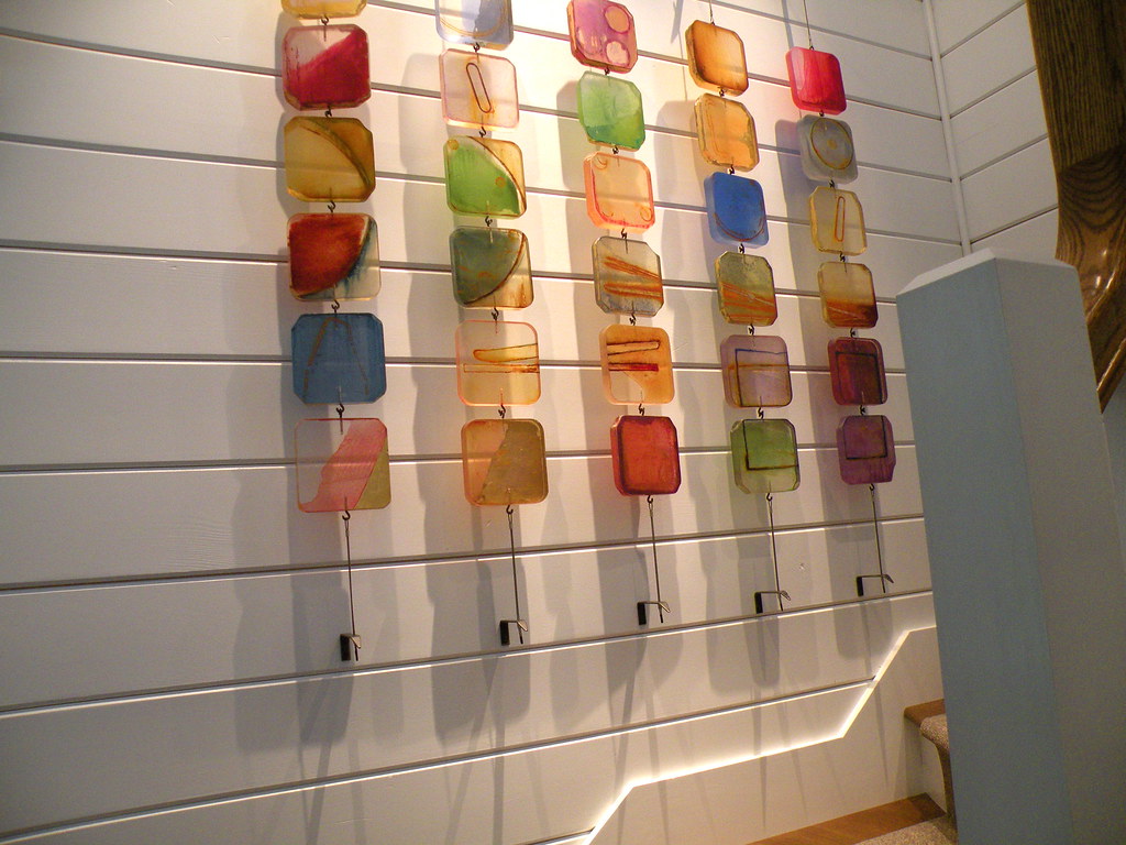
Filling up the long tall staircase wall is this colorful sculpture by
Carrie McGee through
Lanoue Fine Art on Newbury Street in Boston. I'd blogged about Carrie's work when I saw it in an art show a couple years ago, so was pleased to see another one of her fabulous pieces on display.

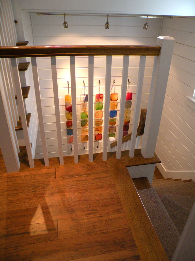
This is the second floor landing. The flooring is Rosedown Hickory by Shaw, which
has 50 percent recycled content and comes from managed domestic forests. The stairs continue up to a tiny third floor tower room, which I didn't get up into because there was an interview going on.

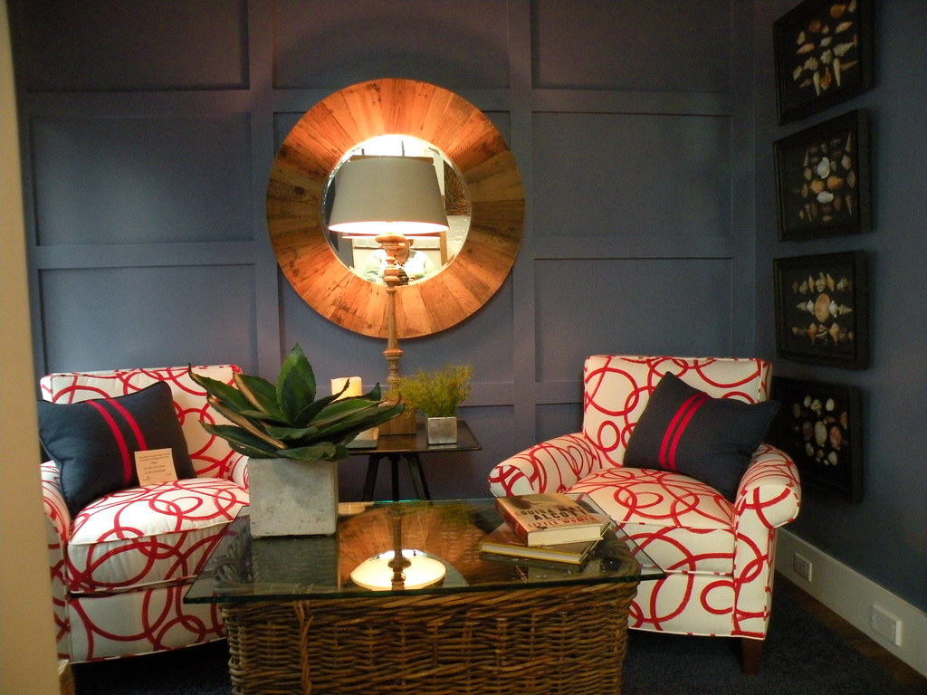
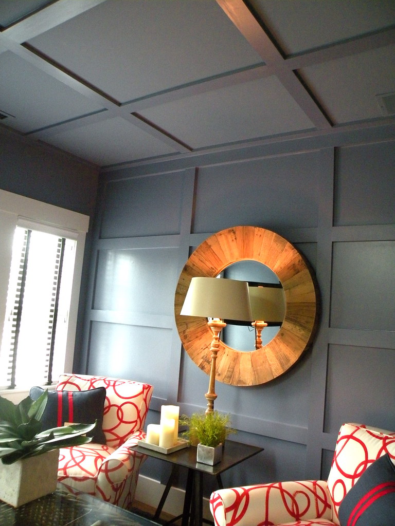
This is the sitting area at the top of the stairs, outside the master bedroom. I have a lot of questions about the usefulness of this space, which I'll get to later on. Meanwhile, it's a cute little area most notable for the ceiling treatment which is a continuation of the wall treatment and also conceals the attic access.
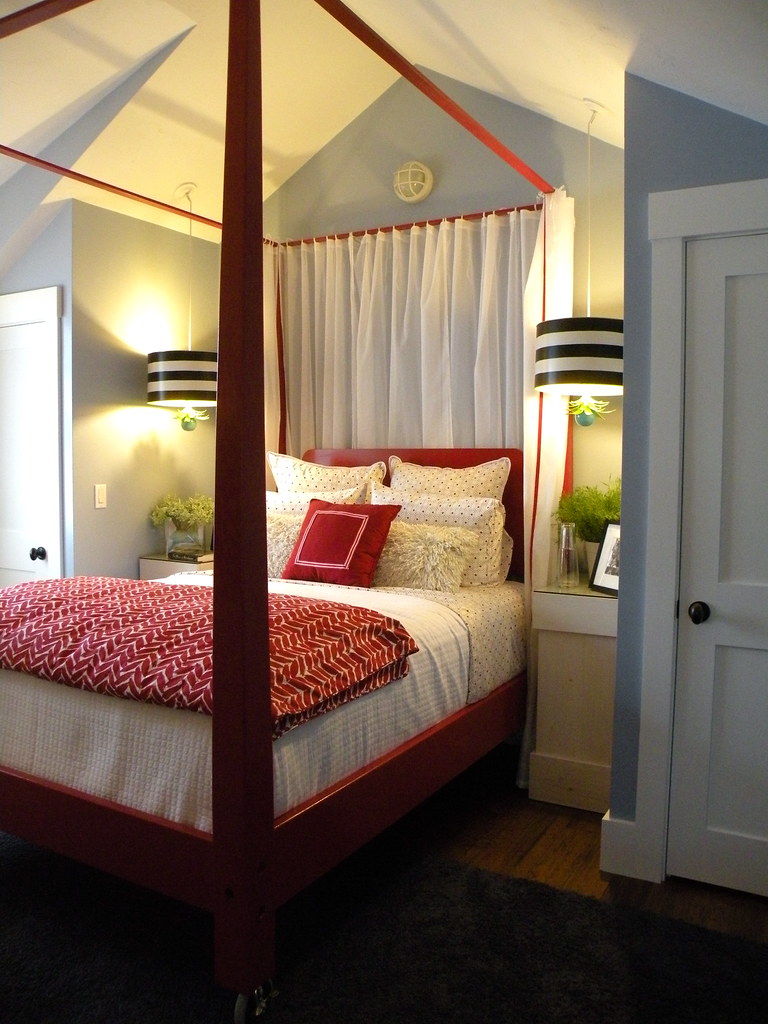
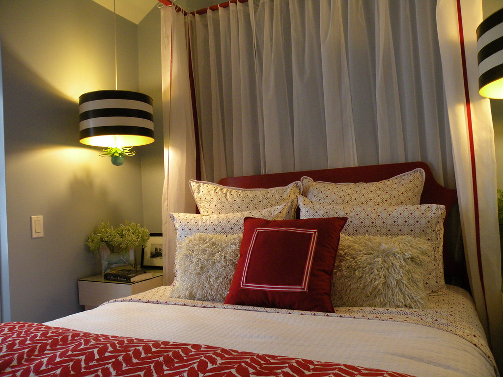
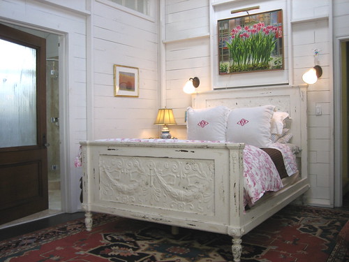
Below is the master bedroom which is very cheery and bright. The four-poster bed was custom built out of old doors and painted in Sherwin Williams Heartthrob. The bed is mounted on industrial style casters, which Jack Thomasson told us was for ease of movement so the bed could be pulled out and cleaned behind. The bed is snugged in the eves and between a closet on the left and a false closet on the right. This is actually the other side of the en suite bathroom in the second bedroom - another area of confusion for me.

You can see the small closet in the background of this photo. Initially, I thought this was the only closet in the room, however, review of the HGTV website shows that I missed a fairly big walk-in closet in the room. So, I am feeling better about the design plan. The wall color is Sherwin Williams Windy Blue.
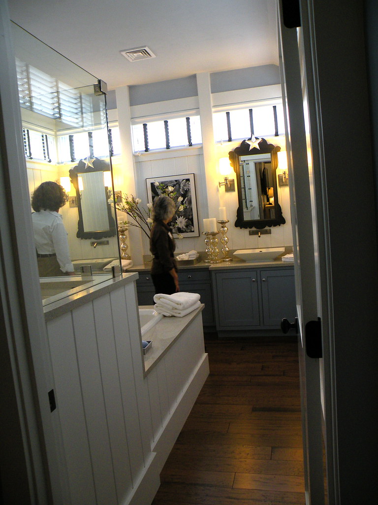
Here is the master bathroom. This isn't a great photograph, but it helps orient the bathroom, which is off the bedroom right behind the chair above.
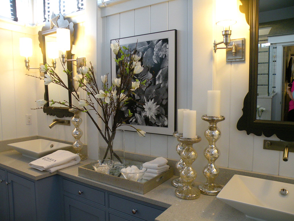
The double-sink vanity area is very nice. The Caesarstone natural quartz counters are topped with simple white vessel sinks and modern wall mounted faucets. The planked walls are topped by a series of shuttered windows overhead. Lot's of windows and great light with no privacy issues. The Chippendale style mirrors are a nice reminder of the history of the area, although the applied stars are a little hokey.

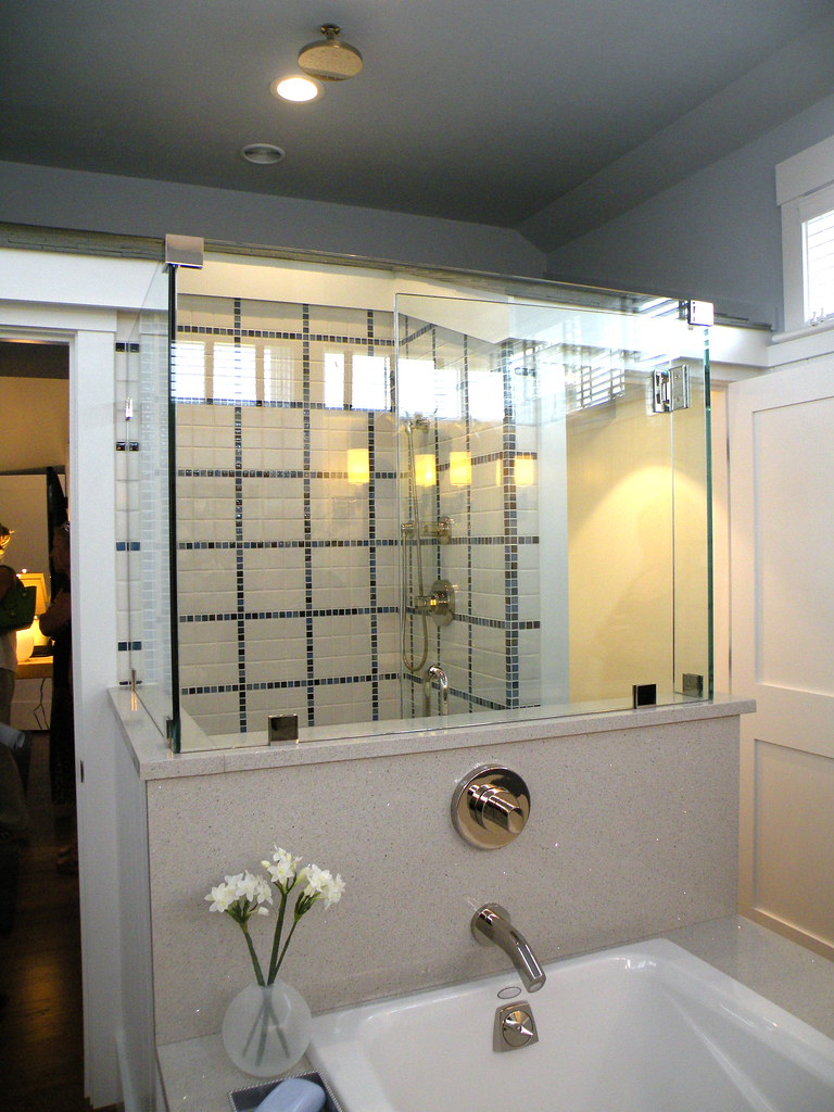
I will admit to loving the outdoor shower feel of the shower area behind the soaking tub. A false "roof" complete with shingles, was built around the shower with a rain head faucet mounted above. Living so close to the beach, many of our homes have outdoor showers to help clean off before treading sand through the house. So, this was a nice touch.
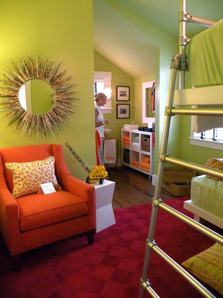
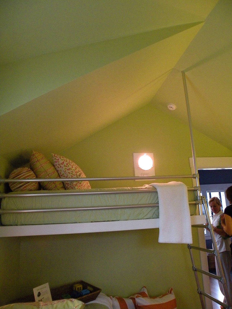
And now we head into the second "bedroom" of the home. There are only two and unfortunately, this small room doesn't really qualify as a bedroom. The Commonwealth of Massachusetts requires that for a room to be called a bedroom, it must have a closet. This small bedroom, staged like a boys room, has no closet, but does have an ensuite bath room. I think there was a better option for this arrangement, which I will go into below.
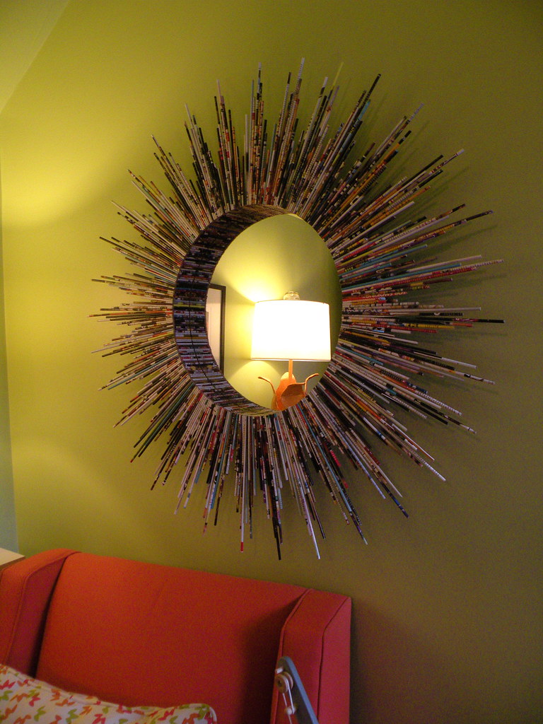
The snappy orange and green (SW Hearts of Palm is the paint) color palette was inspired by the bathroom tile. There is a loft-style bunk bed which is modern and sleek looking. The carpet is Desirable Statement by Shaw. The mirror is a lot of fun, but ironically (in a "smoke and mirrors" kind of way), the mirror was propped up straight in the back by a wad of what looked like paper towel.
There is no room for a desk or any kind of work space in the room and as I said, there is no closet.
The ceiling is painted the same color as the walls, which certainly worked to open up the space.
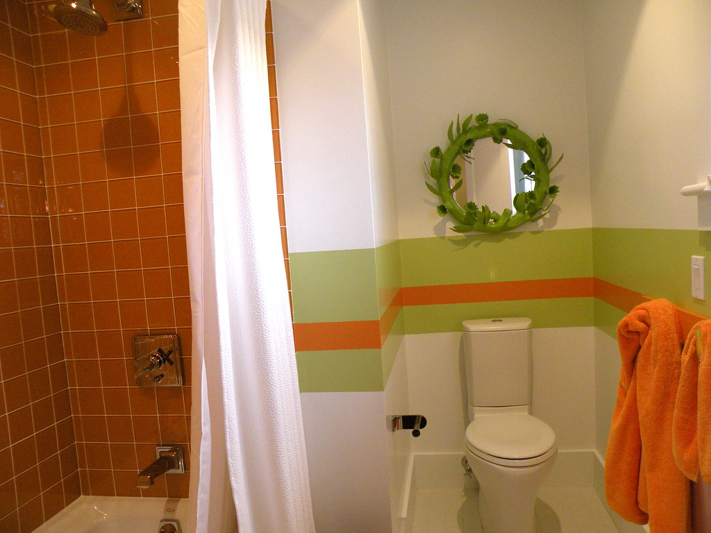
The en suite bathroom is also a fun space for a kid - although I would say that the choice of orange for the tile was a bold one that is likely to cause problems for future homeowners. But, as a decorative statement, the glass tiles are beautiful.

So, what's my problem?
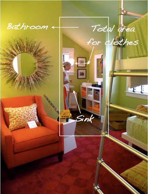
To my mind, it didn't make the best sense to build in a full bathroom as part of the second bedroom. First, there wasn't even room for the sink in the bathroom. If you notice in the photo below, the sink is actually open to the main room in the so-called closet area. The bathroom is to the left. If nothing else, had they installed a stall shower instead of a full bathtub, the sink could have been accommodated inside the bathroom proper. Or they could have done a small linen closet. Instead, you can see the linens are to the right side of the sink. There is no closet in this room and the tiny area to the right of the sink is not sufficient for anything but baby-sized clothing. And as I mentioned above, a room with no closet is not an acceptable bedroom in Massachusetts. So, the winner may find selling the house down the road as a two bedroom to be a problem as realtor's will generally not list a room as a bedroom without a closet. And whoever lives in the bedroom will most certainly have issues with storage, unless they remain an infant.
Here is the floor plan as it is (plan courtesy of HGTV.com)

And here is what I might have done:
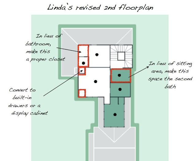
As you can see, I have removed the pretty blue sitting area at the top of the stairs and installed the second bathroom there. It could be a 3/4-bath with a nice stall shower if a bathtub doesn't fit. A tiny two bedroom home does not need two bathtubs and since there is one in the master, then a stall is fine in this bathroom.
REVISED TO ADD:
An eagle-eyed design friend of mind noticed in my suggested plan above that I was missing a doorway into the master bedroom. See what happens when you rush design? So, here is my revised, revised plan. In this version, I have added an inset into the newly located second bathroom to accommodate entrance into the master bedroom. Because of this, I've pushed the second bath into the master closet space and then pushed the master closet into what was the shower/toilet closet space in the master bathroom. Thus, we've had to lose the soaking tub in the master. However, we now have more room for a tub and shower in the second bathroom.
While the sitting area is pretty, it's not a terribly necessary space. The third floor
tower room (which is staged as a home office with a day bed) is right up the stairs. So, the result is two semi-private sitting areas in close proximity. Plus, you have the entire downstairs, a covered veranda and yard. There is a lot of private space for the home's inhabitants. By moving the second bath to this space, the loft then becomes a potential guest room with access to a bathroom. The two en suite bathrooms are basically off-limits to guests. Not very pleasant.

If you notice, the master bed is recessed between two closets. In fact, the right hand "closet" is actually not a closet- the door opens to a mirror. The second bedroom bath takes up this space. So, in addition to all the reasons I've outlined above for the poor location of the second bath, the final is that it encroaches on the master bedroom, which is already quite small for a master. As there is a nice walk-in closet for the master, there might have been an option to remove both closets flanking the bed, which would have significantly enlarged the space. Or, there could be two closets, or on could have been turned into a built-in book case, vanity space, display cabinets, set of drawers. There are lots of options.
Anyway, those are just some thoughts I had about the Green Home. HGTV reports that there were over 17.5M entries and they have actually already selected a winner. The winner will be announced in Boston Monday nite at 8:00PM EST. Even though I've had some suggestions for changes, this will be a sweet house for some lovely people. I'll leave you with a little Pinehills prettiness (the Plymouth location of the Green Home):


 Subscribe to ::Surroundings::