I'm spending the week minding my friends Scott & Diana Cooper's French Antique showroom, Trianon, at the Boston Design Center. I started poking through a book they have on their coffee table on interior designer Juan Pablo Molyneux and was instantly captivated by the unabashedly high end, yet witty designs. The book. published in 1997, showcases some of his bigger projects between the years of 1985, when he began taking work in New York, and the mid-90's. Mr. Molyneux was born in Santiago, Chile and spent a childhood surrounded by a mixture of British and indigenous influences. His maternal grandfather was British, who got a little lost on his worldwide grand tour and ended up in Santiago, where he fell in love with a beautiful local girl. His parents were well-traveled and so was he. He attended a "veddy British" boarding school in Santiago that, as the book says, "was like a little British colony...". It is due to these experiences that Mr. Molyneux attributes his attraction to English design: paneled walls, Regency furniture, and "the patina of age and elegance that develops out of being rooted in one pace for generations". In 1946, he enrolled in the architecture program at the Catholic University of Santiago and was immediately immersed in the disciplines of La Corbusian modernism and all things Mies van der Rohe and Walter Gropius. There was no study of classical architecture - as if the field began only in the 20th century. While he loved what he was learning, he instinctively knew that he was missing out as well, so enrolled at the Ecole des Beauxs-Arts in Paris - where he nearly failed his initial project assignment of designing an orangerie. He had to learn an entirely new vocabulary of architectural design - the work of the ancient Egyptians, Andrea Palladio and even Jacques Ange Gabriel, designer of Le Petit Trianon, which Mr. Molyneux feels is one of the most "gracefully precise" buildings ever designed (and who could argue with that!). Over the next several years, Mr. Molyneux traveled back and forth between his classical training in Paris and the modern aesthetic espoused at University in Santiago. Even in Paris, the social unrest of the late 60's provided a certain push back against the old school classics espoused by the Beaux-Arts. Upon graduation, he traveled extensively throughout North and South America, Africa, Russian and, of course, Europe. He opened is own design practice in Santiago in the early 70's and quickly became a recognized and lauded designer. However, due, in part to the social unrest and military coup in 1973, work was scarce in Santiago, so he moved his business to Buenes Aires, which he found to be more cosmopolitan, and more classical inspired design wise. He remained there for the next ten years until the lure of New York City overtook him. He developed a client base in NY and traveled back and forth until 1987, when he moved there permenently. He quickly came to the attention of the Architectural Digest editors and is on their AD100 list. He is now a US citizen and is still practicing in New York.
What attracted me to the work showcased in this now out of print book, Molyneux by Michael Frank, was not the OTT glitz and glamour of his spaces, but the quieter moments and the whimsy. His use of trompe l'oiel (a personal favorite of mine) is both beautiful and fun. He views trompe l'oeil not as something fake, but as a way of freeing oneself from the inherent restrictions of built architectural details. As he said "With trompe l'oeil, you can create spaces, moods, shapes. It's not fake. That's what people usually say, and it's wrong. Trompe l'oeil is a fantasy that provokes reality". Love that!
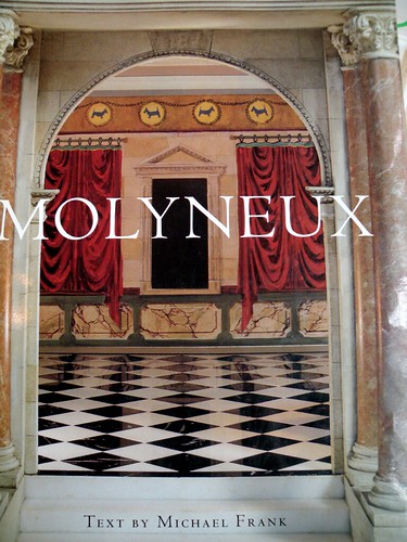
Take a close look at the book jacket art below. This is called the Palladian Dog House, which he designed for a Kips Bay showhouse. His client? His beloved Scottie Max, whom he described as having a "noble, Palladian personality". The structure was sized for Max - at 3' square, with a portico in front with Corinthian columns and a pediment. Max's coat of arms (crossed bones) was also prominent. The house was made of plywood, except for the real marble floor - which was perfect as it was a "summer house". Could you just die??? The rest is a tromp l'eoil masterpiece!
The living room below includes a tromp l'oeil depicting a seascape and "paneled" doors opening up to it. There's something so easy about this room - despite the immense work this painting represents.

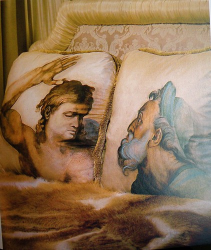
Mr. Molyneux's own houses were showcased in the book as well. I am so in love with the Michelangelo inspires pillows on this bed! It's so unexpected and lively! And steal-able. While these pillows were likely hand painted. one could also print the art onto transfer paper and apply to a plain silk.... hmm... I feel a DIY project coming on!!
 btw - have I mentioned that I shot photos from this book as I don't have access to a scanner today? So, my apologies for the less than perfect images!
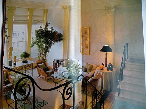
This next space was a New York pied-a-terre for the children of a well known restranteur. They were looking for something "young, light-hearted and European". The architectural details in the living room were left as is - as they are clearly very formal and balanced - while the furnishings and surfaces are significantly more casual and almost outdoorsy. For those who find symmetry boring, this is not your space - no question! Both sides of the room are nearly mirror images, however, I fell this works to achieve a peaceful space amid the hustle and bustle of the big city.
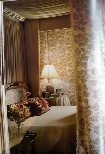
 The image below is the master bedroom in the Molyneux country home in Western, Mass. How cozy! The linen, from Portugal, was selected because he felt that the floral pattern lent the space a wonderful country feel. How true - without being cloying, or "horsey"! Note that the headboard is very similar to the one in their New York home with the pillows shown above. Clearly a signature style!
 I find this little bedroom vignette to be quite charming. The shade of blue is just lovely and I adore the toss pillows - it's hard to tell in the photo but they almost look like they are made from an organdy as there seems to be a translucent quality about them. The headboard fabric, interestingly enough, was also used in another of his projects - on both a chair and another headboard of the same style. I'm fairly certain that it's not the same headboard as the pattern placement is different.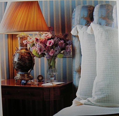
Mr. Molyneux has been a frequent decorator showhouse participant. This gorgeous dining room (in shades of blueberry blue and parchment that I just adore!) was for the 1988 Kips Bay Decorator showhouse. The chinoiserie wall panels, painted in the 1920's by Alan Cox, were original to the room and set the stage for the design plan. Mr. Molyneux had their gold and silver- leafing restored as well (which unfortunately can't be seen in the photo - but must have been magnificent!) The window treatment fabric silk was first manufactured in the 1920s and had enough silver in it to relate to the silver-leaf on the walls. The carpet - of his design - had a decided "chinoiserie mood". He also incorporated some Chinese blue urns from his own collection, but in a departure, selected the gothic revival dining chairs for their architectural detail. As a final whimsical note, Mr. Molyneux wrote out name cards to "John, Mary, Susan and Howard" rather than the normally stuffy showhousey habit of making the name cards to "Sir this or Lady that". Little touches of humor and earthiness abound.

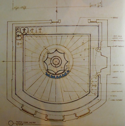
This image is the drawing for the center medallion of the floor in Mr. Molyneux's 1995 Kips Bay design.
 And below that is the painted marquetry medallin realized.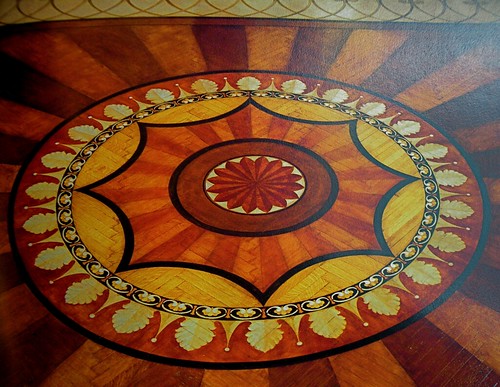
And the entire room:
 Some details:
 And note the return of Max, the Scottie dog: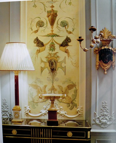
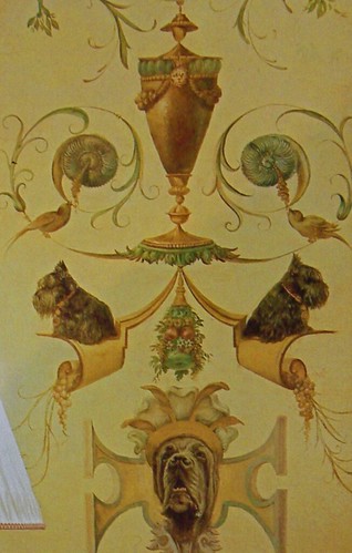 Don't you just love the swank with a little humor??
This is a just a taste of the rooms showcased in Molyneux by Michale Frank. Unfortunately, this book is out of print, but used copies are available. You can also see more recent photos of his work here, here and here at his website, and here's a little youTube I found. Enjoy!