Thursday, February 26, 2009

Ballard Designs and chatting with designer James Swan

Interior designer James Swan relaxes in a room he designed for Ballard Designs.

I've always been a big fan of the Ballard Designs catalog. The products are pretty and right up my personal style alley! In this day of down and out-sizing, the folks at Ballard have been creating cross promotions and relationships that are actually quite unusual for a mail order business. In the last year, they had developed a relationship with the lately lamented Domino Magazine - showcasing the Domino Editors' catalog picks. Smart. The hip folks at Domino brought a level of relevance to a catalog that might have started seeming too niche. Unfortunately, with Domino out of the scene, it would seem a big loss to the marketing of Ballard. But, as I said, they seem to have some pretty smart and creative people on staff.

Their latest project is to partner with Beverly Hills designer James Swan. James has a nation wide clientele and is quite media savvy on his own. Ballard brought in James to design a series of rooms using nothing but items from the Ballard catalog - and they did these room designs in a real home. Now, designing a room using the goods from a catalog seems very obvious - and not unique. But, there is clearly something unique when a working interior designer is on the job as opposed to a photo and product stylist. While Ballard often uses real homes for their photo shoots, this project clearly took things to that next level - to create a mood and a whole, livable space. James also brought in a new, more masculine, perspective to Ballard's products. Smart.

Here is an example. The first image is a standard Ballard Designs roomset for their home office products. Pretty, uses a lot of products and the open windows really help create a sense of place. But still... fairly standard catalog fair.

And here is James' take on the Ballard home office. There is an attention to detail that comes from someone who works with real people. It feels like the owner has just stepped away.

James Swan's take on the home office

I had the opportunity to have a nice phone chat with James last week, which I hope you will enjoy. Just please, forgive my scratchy voice! I was getting over laryngitis.


Click on images for larger views.

Thanks again to James Swan for the interview and thanks to Ballard Designs for sharing the photos!


Subscribe to ::Surroundings::

Tuesday, February 24, 2009

Highlights from IMM Cologne 2009

Seracs stand at IMM Cologne, 2009


Contributed by Susan Schultz


“Cautious optimism” seemed to be the key phrase at IMM Cologne. Everyone—the show producers, the exhibitors and the attendees—seemed to be pleased that traffic was only slightly down, overall exhibitors were only slightly fewer, etc. It did feel as if many of the exhibitors had cut back on their product introductions, but there were still so many great new pieces to oogle over.


Adaptable, flexible use sofas were introduced by several of the major European furniture brands, and one of them was an IMM Cologne award winner.


First up is Confluences, the aforementioned award-winner, designed by Phillipe Nigro for Ligne Roset. Nigro’s challenge was, as he put it, “to create a sofa capable of satisfying the greatest possible number of users. It would have to accommodate many different body shapes, seating preferences, taste and space requirements…” The result is a series is shapes that fit and flow into each other to create hundreds of different seating combinations, from a single lounge chair to four-seat set, to a contemporary take on the vis-à-vis. It’s an ingenious system that hides its deeply researched and engineered concept in a deceptively simple form.


Next is Threesixty, a new introduction from Walter Knoll that builds off the company’s success with its Lazy Island and Living Landscape collections. Threesixty is a smaller, more streamlined piece that either of its two predecessors, but to my eye, far more elegant. The two base seats fully rotate in any direction, allowing the backrest to act as an armrest, a side table, or even extra bench seating. As static photos don’t really do this piece justice, I recommend this link for a little animation that shows the functionality. And given the quality engineering the Germans are known for, each piece moves and rotates so easily…really one of my favorite pieces I saw at the show.


Seracs, designed by Alfredo Häberli for Fredericia consists of five pieces that can be infinitely arranged and added to, allowing clients to create a piece best suited to their requirements. If you’re on a windows system, you can check out the Seracs planner which allows you to choose the upholstery and color for each section and play around with the arrangement. Häberli, an Argentine who has had a studio in Switzerland for many years, also designed the Kavdrat wool fabrics for the upholstery.


Another consistently strong category at IMM Cologne is that of shelving and storage systems. Perhaps because Europeans typically live in smaller homes than most Americans, attractive, flexible solutions are always in demand.


Arie by Arik Levy for e15 can work as a long, low linear shelf, a single book shelf or a corner unit. Hidden supports mean it works as either a free-standing unit or can be attached to wall, and also helps lock the sections together if desired. Currently available in either solid European Oak or white powder-coated MDF.


Suitable for either the hedonist or the workaholic, Magic Cube from Yomei is a not-so-basic box that can be outfitted as a bar, a dressing table, or a computer workstation. Thanks to innovative customization each version is as functional and as stylish as the other. As a bar, the Magic Cube includes a mini-fridge, a back-lit mirror, plenty of storage shelves and a power outlet for a blender; in working mode you can get an extendable desktop, integrated surge-proof outlets and additional shelving for all those digital accessories. As a dressing table, that large backlit mirror is back in place, along with felt-lined jewelry drawers, outlets for your hair dryer and curler and cosmetic storage. Beautifully finished with leather drawers and trim, it can be further customized in myriad ways.


My final shelving selection comes from the d3 design talents section of IMM Cologne. Marco António Palas dos Santos Pina, a Portuguese designer studying in Düsseldorf introduced Verwoben, a shelving unit that allows the user to thread a textile “runner’ through a series of slots cut into each shelf. Clips keep the fabric taut and make it a fairly simple process to change out the fabric for a new look when the mood strikes.


Photos and text contributed by Susan Schultz


Click here to read all of Susan's posts.

Monday, February 23, 2009

Little Town, Big History

I've written before about living here in Duxbury, MA - a small town on the South Shore of Massachusetts, just north of Plymouth [America's Home Town]. Duxbury was founded in 1637 and has its share of historical sites.

Beginning in 2010, the U.S. Mint will be releasing five new quarter designs every year in a program called America’s Beautiful National Parks Quarter, similar to the 50 States Quarter Program. One preferred and three alternate sites in Massachusetts will be submitted to appear on the reverse side of the quarter. The Commonwealth of Massachusetts is running a contest to select the four recommended historical sites out of a slew of nominated places from around the state. And, my little town has five of the ten sites nominated from my county!

The Alexander Standish House is said to date back to 1666. It is privately owned and the least known of our historical homes. It was added to the National Historic Register in 1978.


The Adlen House was the home of John and Priscilla "Speak for Thyself, John Alden" Alden. This 17th century site is still owned by the Alden Kindred of America.


King Caesar House (owned by Duxbury Rural & Historical Society).
Photo by Linda Merrill for
::Surroundings::

The King Caesar House was home to Ezra "King Caesar" Weston - a shipping magnate and one of America's first millionaires. This house, built in 1807 is classic Federal style and still retains much of it's original mouldings and pictorial wallpapers.


Built in 1840 in the then popular classic Green Revival temple style, the First Parish church was the fourth in a succession of meetinghouses which started in 1637 with the First Meeting House, led by Rev. Ralph Partridge, who assisted the aging Elder William Brewster, who was the original founder of the town. I am intimately familiar with this building, as I lived nearby when I was growing up. While I wasn't a member, I did use the grand piano in the sanctuary for practice when home on vacations from music school. And, more interestingly (well, to me at least), I once climbed up to the belfry with a friend and we scratched our initials inside the bell. Now, I'm not actually sure if it's the same bell, but if it is, and this is the winning historical site - well, that's got to make me a Bacon-2 away from being on the quarter!


The Wright Memorial library was built in 1909 and added to the National Historic Register in 2007. It was built by architects Joseph Everett Chandler and John Osborne Chesley Jr. in the Neo-Renaissance style. This building was until the mid-80's the town library and is now the archives and research library for the Duxbury Rural and Historical Society. A very un applealing 1960's addition in the rear (not shown) now houses the Duxbury Student Union - a hangout place for middle and high school students.


Of course, there are many other important Massachusetts sites nominate for this honor - such as:


Edith Wharton's home The Mount

Do you have a favorite? Within my town, my vote would be for The King Caesar House, but I have to say, I am partial to The Mount and Beacon Hill.

Click here to vote by February 26th!


Subscribe to ::Surroundings::

Friday, February 20, 2009

My Inner Pink - Living Room Chronicles

A couple of years ago, Martha Stewart profiled her all pink Maine cottage interior in her magazine. I think this was the point when I really started to think seriously about painting my living room/dining room pink. I also realized that anytime there is a magazine on a newsstand that has a predominantly pink cover - I make a beeline right to it and usually buy it. We need to listen to these visceral reactions!

Because I live in a condo that has vaulted 16' ceilings, I can't just slap up paint to try it out. So, I'm still dealing with all white walls and getting tired of it. I could really use a pick-me-up right now too! I've been slowly morphing from a green, black, white and cranberry color palette to a softer green and pink, with some black and dark stained woods.


This year, for Christmas, I did a pink and gold theme, and loved it!

Last summer, I reupholstered this cane back settee and made the striped tablecloth - and really committed to the pinkier palette.

I've been collecting images of favorite pink rooms in order to get some inspiration about the tone and shade of pink that really appeals to me.


House Beautiful - Mary McDonald design - Benjamin Moore Coral Pink 2003-50. I love this look (well, not the rug, so much). The walls are such a strong, statement pink and the blue/white chinoiserie dishes really pop. But, ultimately, my space is just way too big for such a strong color (for me at least!)


This House Beautiful image (wall color is Pantone's 705-C) has tall ceilings and the lovely French-y feel that I like. But, I think this color is a little bit too chalky.


This House Beautiful image ( 30 days of Color ) is a design by Suzanne Kasler. Gorgeous and it certainly did make the rounds on the blogs. I love how she mixes beige and pink together. (And how easy is that artwork on the wall? Could be just a pretty piece of fabric wrapped around a board!). Very pretty - but it looks like it tilts a little towards the purple.

This Suzanne Kasler dining room (which I first saw on Joni Webb's Cote de Texas) practically defies adjectives it's so beautiful. I could stare at it for days (and may have...). It doesn't have pink walls, rather beige, but the drapes, the upholstery - knee weakening beautiful. However, since I've already committed my upholstery to the greens (and can't afford to reupholster) I do need to stick with putting pink on the walls. But, this palette is tucked away for the future. It will be mine!!


These two images are by Steven Shubel on House Beautiful. Certainly, very pretty. But, the color just seems too... shallow?

I do love this darker pink from Steven Gambrel in Domino Magazine. It seems mature without being old; deep and rich, without being dark. And, it plays off the green quite nicely. But then I think of all the wall space I have, and I start to feel overwhelmed by it all!

This room, from Domino Magazine, uses Benjamin Moore: Pink Lilly. It seems to work nicely with the greens and would probably look very well with my complexion (never underestimate the value that the right paint color has when it comes to how we look!).
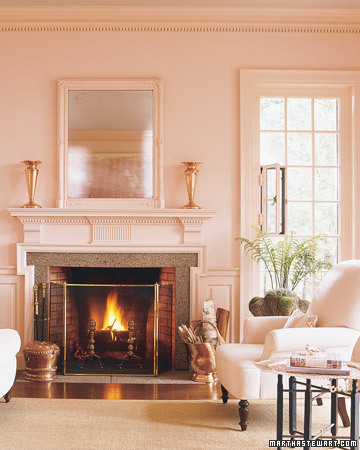

This Carlton Varney living room (which actually looks the closest to my own, architecturally) really caught my eye. If you saw it in House Beautiful, you may remember that the colors are richer than they appear in these online photos. With the exception of the floor (mine is dark cherry stained oak), the rest of the palette is very similar to what I already have now.


This space just feels happy and a little bit beacy. Since I live near the ocean, it just seems appropriate.


By the way, have you read House Beautiful's COLORS FOR YOUR HOME? It's a handy little guide that showcases the 300 colors various designers like the best - and why. What colors work best in which rooms. It's a perfect size for throwing in a purse (okay, a large purse) when shopping!


Now, all I need to do is find someone willing to hike up the tall ladder and start painting for me... anyone... anyone.... ?


Check out what Julia - and many other folks - is Hooked On this week.


Subscribe to ::Surroundings::

LinkWithin

Related Posts Plugin for WordPress, Blogger...
Get Paid To Promote, Get Paid To Popup, Get Paid Display Banner