Sunday, October 31, 2010

The Skirted Roundtable: Chatting With David Easton

What do...


...and...

Parish Hadley's design for Babe Paley's living room


...and...


...have in common?

This gentleman:


Please join Megan, Joni and I as we chatted with design and architecture icon David Easton over at The Skirted Roundtable. He is a charming, charming man with strong opinions about the future of design - and given his background, we should be listening.

Mr. Easton is also offering a signed book as a give-a-way - all those who comment here will be entered to win!


 Subscribe to ::Surroundings::

Saturday, October 30, 2010

Revamped! 'The Sitch on Fitch' Gets New Features

The Sitch on Fitch brings to you more media just in time for the holidays - we know you have been naughty, but we don't care...Enjoy!
A new season is here - Christmas 2010 - and so The Sitch on Fitch thought it only fitting to get itself even more better looking for the holiday season! That's right! The page is now more enticing and made even more easier on the eyes (as if it wasn't already!). Every week, you will find a new tune, 'Song of the Week', from past playlists to listen to whilst cheking us out. There will also be a new image featured weekly, 'Image of the Week', from past marketing campaigns or from current events going on just to get you inspired. Not only that, but we have also provided a world map, 'Where in the World is the Company', to give you a perspective on where all company brands are opening and located worldwide. And don't forget to participate in our polls - we tell you what we know on A&F and Company, so we in turn want to here from you! Don't forget to email us if you have some nice info you haven't yet read up here: no personal info will be used and you will be credited for the scoop as "Anonymous Contributor." Enjoy the blog that brings the best of news, reviews, and perspective on everything A&F and Co!

Friday, October 29, 2010

Christmas has Arrived!!! Feeling Naughty, Anyone?

Christmas 2010 has finally arrived at our favorite A&F brands and it is looking very interesting indeed. The season is always the one I look most forward to because it is always the best - great photography, music, and events. Now that is has come, I have some quarterly criticism to dish out...what rocks, what sucks, and what in the world is going on with the redundant marketing!
Main marketing image for A&F "Naughty or Nice" Xmas 2010
Abercrombie & Fitch: The parent brand has rarely failed my expectations, and this one is no exception. I really enjoy it! The poses and facial expressions are always so captivatingly dreamy, euphoric and timeless. The male models definitely dominate the selection (as they always do) because they are the ones that carry a look that exceeds the frame; they look beyond into that timelessness aesthetic that is so iconic of A&F/Bruce Weber photography. The shot of the African-American girl is purely breathtaking as her beauty (and prominent hair) seemingly leans out towards the observer the furthermore he/she stares. The one model that truly stuck out is the female with freckles. I'm sure you all agree. Her image is very country-classic, very innocent and not very "typical Abercrombie." Yet, in that sense, it is so American, and that is so typical Abercrombie. Did I just make any sense? It helps to add that this Christmas is very inspired to be "naughty," and this reminds me so much of the previous scandalous Christmases A&F enjoyed with the Quarterly. Completely fun! A&F "Naughty or Nice?" Xmas 2010 is honestly high-photography at its best, as it should be, as is always Abercrombie & Fitch.
Main marketign image for abercrombie good* xmas 2010
abercrombie: At the start, I found the marketing of abercrombie *good xmas 2010 as highly wonderful. The main image of the little bulldog is very "cute" (especially with the caption "I've been good* this year) and captures that classic child-essence; that of mischeivious innocence, a quite wonderful juxtaposition. Then, the selection continues with a footnote on abercrombie's rather out-of-the-Oxford-dictionary-sounding cheeky footnote which clarifies what being "good" implies (to abercrombie standards, at least). I had to laugh; it is so fun, mock-intellectual, and a footnote I think most of us will find quite handy come Christmas morning! The marketing was great...until redundancy can rearing its ugly face - yet again! - and I rolled my eyes. The picture in question is of the girl in the navy-stripped  long-sleeve shirt, and it was first used in Summer 2009. Honestly, if there is one thing I have come to hate about A&F is the use of past marketing photography for itself and its other brands. The Company may think that most of its consumers won't notice, but I do and it is annoying, cheap, and scars the campaign. Don't get me wrong, I don't completely hate this campaign. How could I, have you seen the bulldog? And it also encompasses really wonderful new photography, but that one image just drags it down a tad. My conclusion? abercrombie good* xmas 2010 isn't brilliant, it's just simply very "good."
Main marketing for HCo. Xmas 2010
Hollister Co.: Marketing for HCo. is unpredictable. I mean, there are common aspects that you always come to expect and that do come through every time, but the final aesthetic is oftentimes a fun departure from the norm of aged, sepia-color. This time, there is full-color with a watercolor finish! But despite this, it is just weak. The only great image is the main photograph of the male model with the plaid shirt over his shoulders. Really, only the male models pull through fine, in every HCo. campaign, and rarely are female models outstanding. In the case of HCo. Xmas 2010, the two females are so blant (especially the short-haired one who seems to have unattractive gender-issues) that why even bother including them? This campaign begins SoCal hot and then ends so-not right. smh.
Main marketing for GH Christmas 2010
Gilly Hicks: Oh, Gilly, where for art though, Gilly? I really like the new watercolor thing A&F has going on for the GH Christmas 2010 campaign, as well. That is it - well, also the main image of the nude guy tugging on the girl's jeans - pretty much everything else is simply dull! I was so captivated and inspired by the first photography that Bruce Weber produced for Gilly Hicks in sepia (back in 2008), and then he out did himself last Christmas with the hot full color shots! But, this Christmas 2010 is so boring, redundant, and blah that I might just cry! No new photography was shot exclusively for Gilly Hicks; these are images from A&F Screen Test featuring Camille (who isn't exactly breathtaking in beauty, but is passably cute) and Lukas. A&F, if you want to develope GH a brand of outstanding brand image, you are going to have to maintain an original streak and not fall back to recycled redundancy (as if I haven't used that word enough).

Abercrombie Kids Delivers on the Clutch!

Clutch by abercrombie, 1.0oz US$30
Check it out! A new fragrance by abercrombie for the boys, Clutch is sure to bring confidence to its wearer on or off the field! This scent is typical abercrombie: It is masculine, woody and rugged with hints of sophistication and sensuality. This newest cologne sure somes through the clutch with a triumphant touchdown!

Tuesday, October 26, 2010

The bachelor moves to Cambridge


I wanted to share a new project that I've just started this week. My friend and client who lived in the Beacon Street, Boston penthouse above that I worked with him on has finally found a new city pied-a-terre in Cambridge, MA.  He works in Boston and has a weekend house on Cape Cod, so has been looking for a new city home for quite a while.  After undertaking an overwhelming renovation like the Beacon Street place, he wasn't all that interested in tackling such a huge project again.


After looking at several places in and around Boston (including being committed for a year to an as yet unbuilt property on the Hingham waterfront), he finally closed last week on a lovely little condo snuggled right in the heart of the most beautiful old Victorian and Colonial homes in Cambridge, just minutes from Harvard Square. Of all the properties I saw with him, this was the one I personally liked the most and also felt that most suited his needs and personality. One of the best things about working with clients over long periods of time, especially clients who are close personal friends, is that we get to know what someone really wants and needs and can help keep them on track.

So, when I saw the listing for the above condo, I was excited to see it in person. It looked like it was in great condition and move-in ready.  We visited this home in the middle of a summer deluge and it just seemed so warm and cozy, even though we couldn't sit on anything because we were soaked! Just before viewing this property, we'd visited another space that was a top floor condo with skylights and a great view of the Charles River and Boston.  While it was less money, the kitchen and bath were dated and the floors mismatched. I know my client - he couldn't have lived with the dated/mismatched elements for long and before we knew it, he'd be hip-deep in a new reno project, which would ultimately cost more than the price difference between the two properties. And while it's fun to tear down and start over, it's not always the best choice, for reasons having to do with budget, but also personal happiness and comfort. And so, I was happy that he decided on the property above and last week, he closed!


This past Sunday, on another dark and dreary day, we headed up to Cambridge to start the very fun work of making this space his own. I like to work very collaboratively with my clients and I'm blessed that this one has great taste and a collection of wonderful art and Middle Eastern and Afgani rugs. He also takes my opinions seriously, which is nice. Initially, he thought he'd only have to repaint the bedroom (he's a green guy, not a blue guy), but after he'd seen the living/dining area on a bright sunny day, he decided the beige paint was too "skin-toned". It's very pretty and warm on a dark day, but no one likes a flesh toned wall!


While we were originally going to keep the red accent wall in the living room and repaint the brown wall in the dining area to match, we decided to change up that color slightly as well.


And so, the beige walls will still be, beige, and the red/brown walls will still be, yes, red. But getting the right shades is important and we wanted to work with his existing collection of rugs, plus the granite in the kitchen/bathroom which has some deep rusty flecks.

The beige walls will be Ben Moore's Dunmore Cream  HC-29

 And the red walls will likely be Ben Moore Onondoga Clay #1204

Or Garrison Red HC-66, if the Onondoga Clay doesn't work.

The bathroom and bedroom will both be the same color:


Ben Moore's Vale Mist #1494

This is only a 600+ square foot space, so consistency throughout will be key to keeping it feeling larger, yet the accent walls help define the different spaces. Unfortunately, the only downside to the space is that it's ground floor under the building and the ceiling is low-ish, is textured and there is no option for recessed lighting. At this point, we're not planning on removing the popcorn ceiling (it's a huge, miserable job), but you never know, that may happen down the road.  However, the pluses of this space include a fully updated (tho tiny) kitchen and some very nice light fixtures in the living/dining room and all the smaller touches like matching door knobs and other fittings.


By the way, how fabulous is this rug? My client bought it several years ago at the Sandwich Auction House for $100. He's never used it or even looked at it since. And it fits perfectly in the dining area!


And so, we're off on a new decorating adventure! We'll be using some of his existing furniture, but will be looking for a new dining room set and sideboard, and we will be needing a new bed and possibly a new sectional for the living room area. The one he has (pictured up top) is very flexible, but not overly comfortable. And, we'll likely be installing the tv over the mantle. Not either of our favorite thought, but the only other option is to put it on a stand in the corner of the living room, blocking the windows. Final decision to be made on that one!

Meanwhile, I'm also preparing for a photoshoot of my kitchen on Friday for Country Woman magazine. Since my neighbors include cows, chickens and the occasional wild turkeys, I guess I qualify!

 Subscribe to ::Surroundings::

Naughty A&F Offers Up Some Christmas Goodies Before the Season Hits

How exciting is this! Abercrombie & Fitch, and its sister brands, is offering up a taste of what is coming our way this Christmas 2010 (apart from the exclusive look at its newest fragrance, Woods). Honestly, I can not wait for the season to hit stores. It is really going to be interesting to see what the company will bring forth after the extravagant Screen Test campaign! There is definitely a high bar to surpass, and I am expecting it to be great. I mean, every Christmas season is the best of the year. Now that we have gotten a sneek peak at the fashions to adorn the stores this holiday, there is just no way this Christmas 2010 will be any less naughty!

Monday, October 25, 2010

The Secret Garden Mural - True Confessions


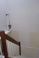
Have you ever started a project that proved to be too big to really handle? Well, for me, it's been my "Secret Garden" mural. I live in a condo with vaulted ceilings. The front entrance/foyer includes the split staircase down to the lower level, resulting in a wall that is, from mid-stair landing, 20 feet tall or so. A tall, narrow wall is very tricky to deal with.

The pic below is the only one I have of the hallway pre-mural (except the beginning of the stone wall section). A big white boxy place filled with jigs and jogs that was uninteresting and bland.


This is the view from my front door into my living area. The stairwell is to the left.


About 7 or 8 years ago, I decided to create a 360 degree mural based on the theme of "A Secret Garden", one of my favorite children's books. With the help of friends, I started painting - a blue sky with clouds, tall hedge and stone wall heading down the stairs. The focal point was supposed to be an opening in the stone wall that lead into the "Secret Garden" in a feat of trompe l'oeil glory.  There was also supposed to be a faux wrought iron fencing around the whole thing as well. Well, best laid plans go out the window after so many years.  The mural languished about 3/4's finished for the last several years and I decided it was time to get it to a finished place (at least, finished enough to call it a day).

And so, voila - gone is the open door into the trompe l'oeil garden interior and I ended up with a closed wooden garden door keeping the inside a secret.


The sky looms over the wall...


Looking back to the front door. The door on the left is to the powder room. I've debated painting the front door to look like a wooden door as well - what do you think? Too much?


I think, in the end, this mural project has achieved what was intended - even if I didn't completely achieve my initial lofty goal. It added color and shape to a bland space - filling it up with life and warmth. Hey, I'm clearly not a professional decorative painter but I hope this shows that anyone can pick up a brush and give it a try.


And hey, it's just paint. It can always be painted over!


 Subscribe to ::Surroundings::

Sunday, October 24, 2010

Friendship and a can-do attitude will take you far

Today's Boston Globe Sunday magazine focuses on Easy and Affordable design and diy projects, including a photospread of a Milton, MA couple who are both physical therapists.  This is a very special story because the photospread - and cover photo - was shot by my photographer and friend Michael Lee.   Well, what's special is that Michael and his wife are friends and neighbors with the homeowners,  Jenny and Colin Highland. The day after the photoshoot took place,  Michael was hit by a motorcycle while walking in a crosswalk and his leg was broken in three places. He was released from the hospital just days before the deadline to submit the images for the photoshoot. I can promise you - he is the hardest working man in design. He not only made his photo deadline, a week after the accident, he attended an industry event where he was a sponsor. I know, because I was his chauffeur/date for the evening and he was still very shaky on the full leg cast and crutches. Amazing. He's since resumed his shooting schedule (including a trip to Nantucket), cast, crutches and all. Thankfully, since he's coming back to my house this week to re-shoot my kitchen for a national magazine spread (details to follow!). A big thanks to homeowner Colin Highland who is working with Michael as his personal physical therapist. It's amazing how far a positive can-do attitude and the kindness of friends will go.

Here are the pics from Michael's photoshoot of Colin and Jenny Highland's DIY styled home. They've created a warm sanctuary for their little family, filled with vintage and modern touches and a sophisticated, yet exuberant color palette.


Photos courtesy of The Boston Globe. Photography by Michael J. Lee. Story by Estelle Bond Guralnick.


 Subscribe to ::Surroundings::

LinkWithin

Related Posts Plugin for WordPress, Blogger...
Get Paid To Promote, Get Paid To Popup, Get Paid Display Banner