A couple of months ago, I had the honor of having a room that I designed photographed by
Michael J. Lee. I have long admired Michael's eye and how he captures a space.
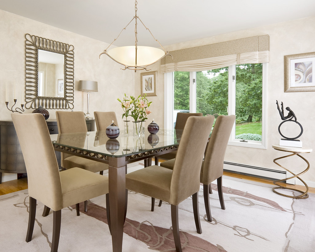
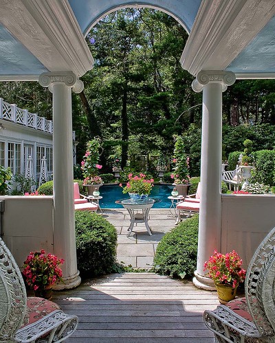
Michael's photograph of New England Design Hall of Famer Richard FitzGerald's Cape Cod house. See more here.
Prior to hanging out his shingle as a professional photographer just two years ago, Michael was an interior designer and worked for two of New England's biggest names in design
Celeste Cooper and Richard FitzGerald. Michael holds a BS in Interior Design from Wentworth Institute of Technology and is a self-taught photographer. After years in the design field, Michael found that his passion was photography and made the switch!
It's clear that Michael's design background informs his photographic vision of a space. For one thing, he knows what he's looking at. It's one thing to have technical knowledge about lighting, mega pixels and Photoshop - but those can be taught. Michael has a deep understanding of scale and proportion and knows about architecture and design. He "sees" the room through a designers eye and shoots the room with a photographers skill. What comes out the other end is pure magic.
Another bonus that his design background brings is that he's not afraid to move things around. And no, that doesn't mean he imposes his own views on the designer's project. Simply that he's not afraid to push something out of the way in order to capture the best essence of the space.
As I said, I was so lucky that he was willing to give me a day of his time to shoot this project! As an amateur photographer who has shot all her own portfolio, I was taking copious notes on how to improve my own skills. Architectural photography 101, as it were. Well, school was in session and session started the week before the actual shoot when Michael and I did a walk through so he could become familiar with the space and we could determine what shots would be taken and what, if anything, needed to be done prior to shooting to "finish" the space. My clients and I were left with a to-do list that was focused and made for a great shoot day.
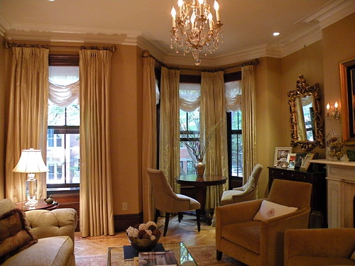
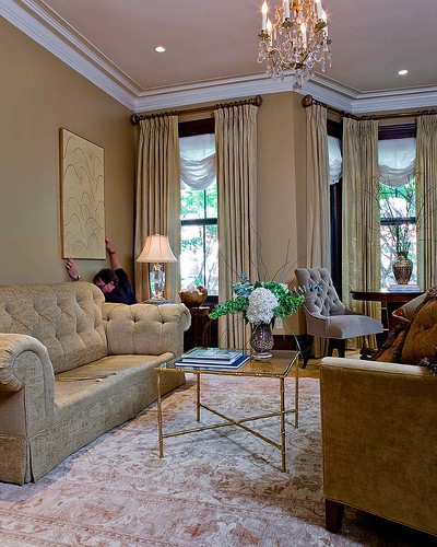
Here is the living room on the day of the shoot. This is my shot, with no additional lighting except what is in the room already. Now, this isn't a bad shot, if I do say so myself. But, there are shadows everywhere and there is a lot of fine detail missing. (Note - this was pre-styling like fixing the window treatments!)
photo by Linda Merrill
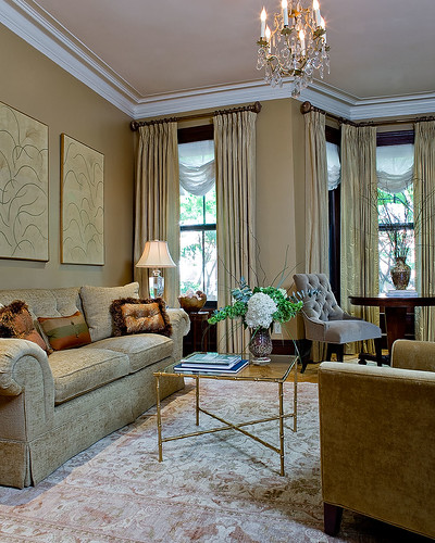
Here is Michael's shot. The lighting is even across the entire shot and the fine details are easily visible.
photograph by Michael Lee
Now, here is a little bit of photography magic. See those beautiful Japanese Leaf panels hanging over the sofa in the image above? Well, they are not hanging over the sofa. My client's are slowly selecting art and that wall is big and bare. So, Josh of
Studio 534 at The Boston Design Center kindly loaned me this pair of framed panels for the photoshoot. Rather than actually hang them on the wall, Michael shot one image without the panels, and then jumped into the scene and by eye, we decided on placement. While I had my finger on the shutter button (oh, the power!), Michael crouched on the sofa under the art to hold it against the wall and we shot the photo. The same was done for the second panel (this is the image below) and with the magic of Photoshop, Michael merged the three shots into one beautiful image. Because of the extreme angle, the panels (and pillows on the sofa) all had to be placed quite a bit to the right of the sofa in order to look correct in the final photograph.

(photo by Linda Merrill on Michael Lee's equipment)
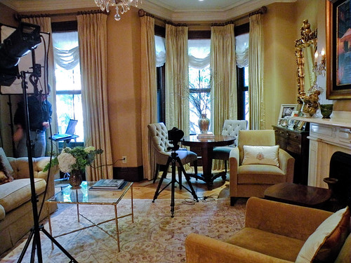
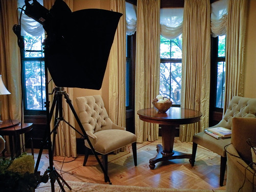
One thing I learned is that there is pretty much no point in completely styling a room before a photo shoot, because it's all going to be torn apart before being put together again! Here's all the equipment as Michael is setting up a shot. Note the furniture is all in disarray.
Photo by Linda Merrill
And here's Michael setting the camera. He shoots directly into his computer, which is all coordinated with the lighting. He gets everything set up and takes a test shot so we could see - on the computer screen - how it all looked and make adjustments to the position of the camera, or tweak a pillow, etc. The final image is shot and approved on site, viewed in large scale on his computer screen.
Photo by Linda Merrill
A very important aspect of Michael's process is that he gets the best shot possible the first time. As he said, he "shoots for the outcome" and doesn't rely on the tech tools of the trade (Photoshop, etc) to make corrections after the fact. Some types of post production work done on an image can break down the quality of the final product. This is a great tip for all of us – take your time make sure the image is as straight as possible and don’t rely on Photoshop or other photo software.
And here is the final shot from this set up:
Photo by Michael Lee
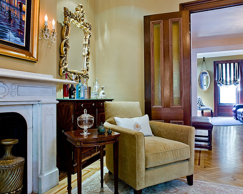
This next shot below was only possible because of the walk through we did the week before. I would have never thought of shooting out the room, down the hall and into the adjacent room. Or, more likely, it would have occurred to me too late. The room across the hall is actually the client's television/media room and aside from the wall color, window treatments and rug, I had nothing else to do with the room and the only furniture is a bank of movie-style leather seats that are not particularly pretty. With advance notice, we were able to create the little vignette of chair (moved in from the living room), mirror (which was purchased at a second hand store for the photo shoot) and the window with bold, striped treatment. Here is another little tip from Michael - create context. What we don't see in this photograph is that the hallway includes a stairwell on the right and a bathroom door and staircase on the left. Michael suggested adding the bench (which we bought down from the client's bedroom) to place against the wall, just peeping into the photograph. Without the bench, the viewer would be left wondering what that space is. Just the added bench gives a context and draws the eye towards the room in the background. The sun was shining full on into the window, so Michael took two images - one with the treatment up and another with the treatment lowered to reduce the glare off the floor. Reducing the glare preserved the beautiful look of the original parquet floor while preserving some of the light from the window. Michael’s shots were taken with a small aperture and a long exposure time, in which he “feathers” in his artificial lighting through the use of several strobes.

Photo by Michael Lee
Here is the setup for the final image, a detail of the small round table, chair and floor. You will see how far out from the bay window Michael pulled the table and chairs and how far over the bowl has been placed.
Photo by Linda Merrill
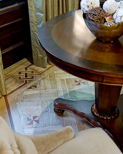
Michael wanted to capture the special quality of the original parquet floor, the beautiful table and window treatment. We spent quite a lot of time setting up this shot and Michael was always asking how I liked it and encouraging me to speak up. The first test photo of this shot seemed, to me, like it was lacking focus and a point - it was just a shot of some pretty details. But, they didn't hang together. We played around with rotating the table so that the base was more prominent and it just made the shot. So, the moral of that is if you're shooting your own space or working with a professional photographer, don't be afraid to ask why a shot is being taken if it's not making sense to you visually. As a designer, I know what this room was meant to look like and how it was meant to feel. The look and feel needed to come through each shot, so patience is key!
Photo by Michael Lee
Here are some of Michael's tips for making a beautiful architectural shot:
- You can't move architecture, but you can move the furniture
- Set the camera to suit the architecture
- Then move the furniture to suit the camera
- Set the camera close to the ground to make the furniture appear at a proper scale. Most rooms are viewed from sitting height, so take the photos from the same height. You can see that in my shots vs. Michael's. Mine are mostly taken just below my eye height, or just under 5' off the ground.
Unlike many photographers, Michael grants “rights usage” of his images to his clients. His belief is that he is simply (or not so simply!) documenting a space that he was asked to, he doesn’t own the room or the design of the room, nor did he discover it like Ansel Adams wondering through a national park. As such, why should he control how the image is to be used? His fees covers his services (walk through, shoot day, post production). He doesn’t feel the need to hold the photographs hostage in order to collect ongoing revenue from the designer or homeowner. Love that about him! His goal for himself is to capture a beautiful image – of someone else's work. The final image is not about Michael Lee and it’s not about high tech computer knowledge and photographic bells and whistles.
Just get the shot, and move along.
On his own portfolio, he always lists the designer and he never sells his photos as stock imagery. A designer will never find his or her own work staring them in the face in a publication without attribution. Michael also suggests that for larger projects where there may be a team - such as architect, builder, designer, etc - all the parties should hire the photographer as a team, which reduces their overall photography costs and makes for the most consistent documentation of a project across the spectrum of disciplines.
Michael's
services include single shots to full day rates. Many photographers won't do the single shot - but often a designer or architect may only need a single shot for an advertisement or other specific use. This willingness to do the small job stems from his time with designer Richard FitzGerald who said "Always take the single chair upholstery job, you never know what it may lead to".
His passion for photography and architectural design is palpable. As he says "I look forward to capturing beautiful environments created by New England's mot talented Architects, Designers and Builders as I share this passion with all of you".
Michael's website is
here, take a look and enjoy the beauty!
Michael's photograph of New England Design Hall of Famer Richard FitzGerald's Cape Cod house. See more here.


 Subscribe to ::Surroundings::
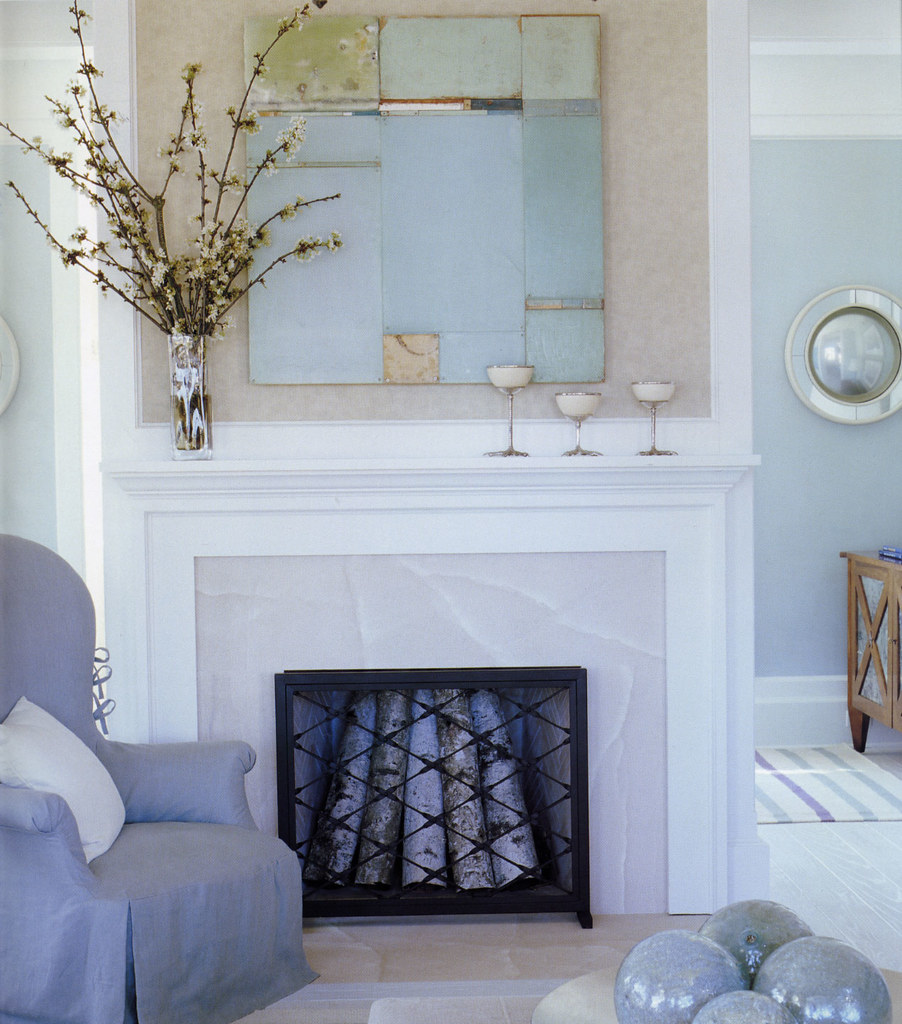


